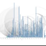
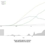
Day 24: COVID Timeline – Bubble Chart and Arc Diagram Day 24: Same COVID cases, arranged by confirmation day. Velocity and lag that networks hide. #100DayMapChallenge. Continue reading “Day 24: COVID Timeline – Bubble Chart and Arc Diagram”…
Day 23: COVID Full Network – Community Transmission Day 23: Full COVID network for Romania. Every case, every link. Transmission beyond county borders. #100DayMapChallenge. Continue reading “Day 23: COVID Full Network – Community Transmission”…
Day 21: COVID-19 Daily Cases in Romania – Case Number One Day 21: Romania case one, Feb 26 2020. Interactive timeline from geo-spatial.org open data. Start of the COVID series. #100DayMapChallenge. Continue reading “Day 21: COVID-19 Daily Cases in Romania – Case Number One”…
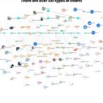
Day 20: Charts Hairball – Choosing Chart Types Day 20: A visual catalogue of chart types by relationship (comparison, distribution, correlation, part-to-whole, flow). Form follows the question. #100DayMapChallenge. Continue reading “Day 20: Charts Hairball – Choosing Chart Types”…
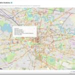
Day 18: Clickable Bubbles – OpenStreetMap Nodes Day 18: OSM nodes as clickable bubbles via Overpass and D3. Tags and community knowledge, not just geometry. #100DayMapChallenge. Continue reading “Day 18: Clickable Bubbles – OpenStreetMap Nodes”…
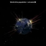
Day 16: Higher Bars Mean More People – Cities on a Globe Day 16: First Three.js experiment: world cities as population bars on a globe. Extrusion turns density into landscape. #100DayMapChallenge. Continue reading “Day 16: Higher Bars Mean More People – Cities on a Globe”…
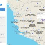
Day 15: Mapping Access to Education – Sierra Leone Isochrones Day 15: Sierra Leone school access with Mapbox isochrones at 15, 30, and 60 minutes walk. Client work for Fab Inc. #100DayMapChallenge. Continue reading “Day 15: Mapping Access to Education – Sierra Leone Isochrones”…
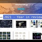
Day 13: The Year I Launched MapTheClouds (2021) Day 13: 2021, the year MapTheClouds launched. Challenges, brand, platform, and a public practice. #100DayMapChallenge. Continue reading “Day 13: The Year I Launched MapTheClouds (2021)”…
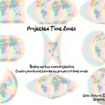
Day 12: The Same World, Eight Different Shapes – Map Projections Day 12: Same Natural Earth countries, eight projections, colors by 6-hour time zones. A map projection is always a decision. #100DayMapChallenge. Continue reading “Day 12: The Same World, Eight Different Shapes – Map Projections”…
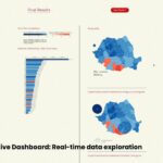
Day 11: When Geography Lies About Votes – Romania 2019 Cartograms Day 11: Romania 2019 presidential votes as five cartogram types. Svelte + D3 dashboard where distortion becomes information. #100DayMapChallenge. Continue reading “Day 11: When Geography Lies About Votes – Romania 2019 Cartograms”…