
Day 20. When you do not know which chart to use 📈
There are more than a hundred chart types. Most people use five.
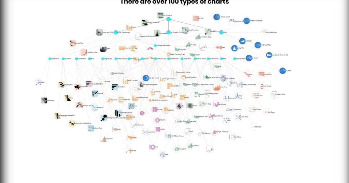
This project is a personal reference. A visual catalogue of chart types, organised by the kind of relationship they express. Comparison, distribution, correlation, part-to-whole, flow. Each node represents a chart form. The connections between them show where boundaries blur and methods overlap.
The inspiration came from three resources I keep returning to: The Data Visualisation Catalogue, The Graphic Continuum, and the Financial Times Visual Vocabulary. Each maps the same universe in a different way. Together, they point to something important. Chart choice is not arbitrary, but it is also not a formula. It is a decision about what relationship you want to make visible.
The “hairball” label is intentional. Before you impose structure, the landscape of chart types really does look tangled. The work lies in organising that tangle, in finding a logic that helps you move from “I have data” to “I have a chart that serves the reader”.
I use this as a thinking tool before starting any visualisation project. Not as a lookup table, but as a reminder that form should follow the question.
Live demo: Chart types hairball
The project
| Piece | Role |
|---|---|
| Nodes | Chart forms |
| Edges | Where methods overlap |
| Groups | Comparison, distribution, correlation, part-to-whole, flow |
| Use | Thinking tool before a viz, not a lookup table |
References named in the post
- The Data Visualisation Catalogue
- The Graphic Continuum
- Financial Times Visual Vocabulary
How to follow
- Blog: blog.maptheclouds.com
- LinkedIn: Day 20 post
- Live demo: chart-types playground
- Previous: Day 19 – Mondrian
- Hashtag: #100DayMapChallenge
#100DayMapChallenge · Day 20/100 · Charts hairball · LinkedIn
Previous: Day 19: Mondrian with Perl + CSS Grid