
Day 23. How does a virus move through a community? 🦠
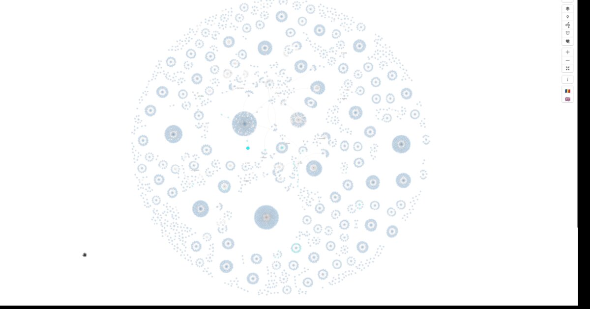
This is the full network view. Every case. Every connection. No geographic grouping. Each circle represents a person. Size shows how many others they infected. Curved lines represent transmission chains.
I built this in March 2020 after seeing a similar visualization by Kontinentalist for Singapore. At the same time, the geo-spatial.org team was collecting Romanian data daily. I offered to build a network view, created a GitHub repository, and published it through GitHub Pages.
Why a network diagram? Force-directed graphs position nodes so connections have similar length and minimal crossings. They are one of the clearest ways to show who infected whom, how clusters form, and where outbreaks may emerge.
Three patterns become visible:
- Superspreader events, visible as dense star-shaped clusters
- Community transmission, with looser, chain-like connections
- Travel introductions, isolated nodes without local links
Interaction mattered. Hover reveals contact counts and source links. Colors switch between county, gender, age, and status. Zoom reveals labels. Pan navigates. A play button steps through cases chronologically.
The technical struggle was performance. Thousands of nodes overwhelmed the DOM. I tried a Svelte wrapper, Canvas links, web workers, and backend SVG generation with Node.js. What I should have done was WebGL rendering, or a proper streaming setup.
But even with limitations, this view revealed something the county-based version could not. Transmission does not respect boundaries. A wedding can create cases across five counties. The network shows them connected. The map shows them apart. This mattered. If cases cluster by event, the response needs to target that social network, not five separate county-level actions.
Tomorrow: the same cases, arranged by time. How fast did transmission accelerate?
Data sources: geo-spatial org API Inspiration: Kontinentalist Singapore COVID visualization
Live demo: COVID case relations (EN)
The project
| Piece | Role |
|---|---|
| View | Full network, no county grouping |
| Patterns | Superspreader stars, community chains, travel isolates |
| Inspiration | Kontinentalist Singapore COVID viz |
| Perf note | DOM limits; WebGL would have been better |
How to follow
- Blog: blog.maptheclouds.com
- LinkedIn: Day 23 post
- Live demo: COVID case relations (EN)
- Previous: Day 22: COVID Network by County
- Hashtag: #100DayMapChallenge
#100DayMapChallenge · Day 23/100 · LinkedIn
Previous: Day 22: COVID Network by County