
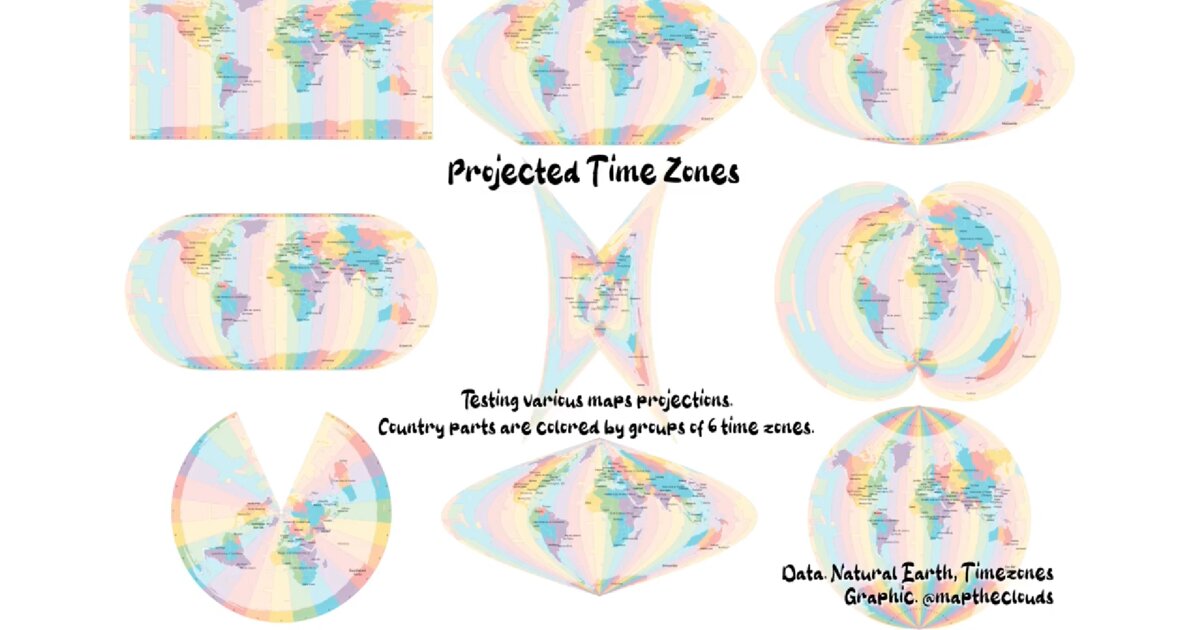
Day 12. The same world, eight different shapes 🌍
What if time zones could tell you something about map projections? This started as a simple experiment. I took global country boundaries, grouped them by 6-hour time zones, and rendered the same dataset using eight different map projections. Van der Grinten. Eckert III. Eckert V. Sinusoidal. Mollweide. Cassini. Equidistant Conic. Polyconic.
Each projection preserves something and distorts something else. Area, shape, distance, direction. You can never keep all four at once. That trade-off is the core tension of cartography, and it has been there since the first attempts to flatten a sphere onto a plane.
The colour groupings stay constant. The geometry changes. Same data, very different visual truths. 🗺️
I built this in QGIS using Natural Earth data. The animation cycles through each projection so you can see continents stretch, compress, and reorganise according to a different mathematical logic. It is a small project, but it stayed with me because it makes something usually invisible very clear. A map projection is always a decision. Most maps hide it. This one makes it visible.
Live demo: Earth not flat / projected time zones · Video: YouTube
The project
Day 11 used cartogram distortion so votes outweigh land area. Day 12 uses projection choice so the same countries tell eight visual stories. Colour = 6-hour time-zone groups. Geometry = whichever CRS is active.
Data: Natural Earth country boundaries. Tool: QGIS. Output: animation cycling eight projections.
Eight projections
| Projection | Typical trade-off (simplified) |
|---|---|
| Van der Grinten | Compromise world view |
| Eckert III / V | Equal-area family variants |
| Sinusoidal | Equal-area, interrupted look at edges |
| Mollweide | Equal-area oval |
| Cassini | Distance along central meridian |
| Equidistant Conic | Distance along meridians / standard parallels |
| Polyconic | Historical survey / regional compromise |
No projection keeps area, shape, distance, and direction all true. Choosing one is always a cartographic decision.
Why this day matters in the series
Week 2 keeps making encoding visible: cartograms (Day 11), then basemap math (Day 12). Most web maps bury the projection. This one puts it on stage.
How to follow
- Blog: blog.maptheclouds.com
- LinkedIn: Day 12 post
- Live demo: earthnotflat
- Previous: Day 11 – Romania elections cartograms
- Hashtag: #100DayMapChallenge
#100DayMapChallenge · Day 12/100 · Projected time zones · LinkedIn
Previous: Day 11: When Geography Lies About Votes