
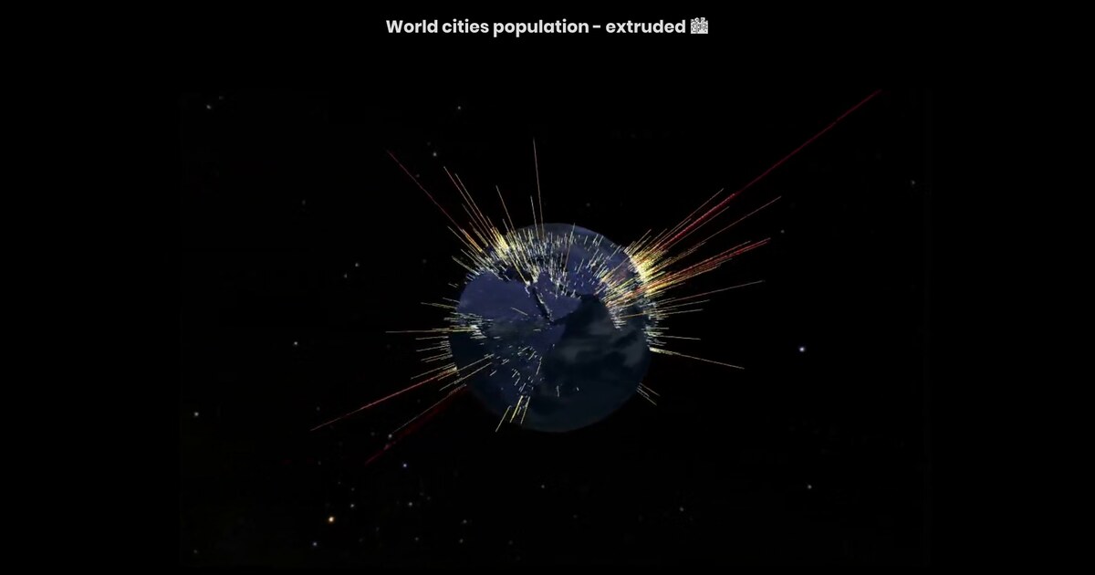
Day 16/100: Higher bars mean more people 📊
My first Three.js experiment: visualize world cities as vertical bars on a globe, where height represents population. Tokyo towers. Mumbai rises high. Smaller cities barely register.
The technique is extrusion: taking 2D map points and adding a third dimension driven by data. Population becomes geometry, turning density into a physical landscape. Height works because it’s intuitive. Twice as tall feels like twice as much. No legend required.
But extrusion brings challenges. Occlusion hides smaller cities behind larger ones. Rotation controls let viewers explore from multiple angles and reveal what’s otherwise invisible.
Sometimes the clearest visual metaphor is also the most direct. When data takes physical form, patterns become landscapes. 🏙️
Live demo: Population globe
Data sources: Natural Earth, NASA Deep Star Maps, Planet Texture Maps
Inspiration: Discover three.js free course by Lewy Blue, ThreeJS 3D Globe Earthquake Plot by Sam Learner
The project
After Sierra Leone isochrones (Day 15), Day 16 is a learning milestone: first Three.js globe where population drives geometry.
| Idea | Implementation |
|---|---|
| City location | Points on the sphere |
| Population | Bar height (extrusion) |
| Context | Globe textures / star field |
| Occlusion | Solved by orbit / rotation, not by flattening |
Why extrusion works (and where it fails)
Height is a strong metaphor: taller ≈ larger. It fails when a megacity hides neighbors along the line of sight. Interactive rotation is part of the design, not an extra control.
How to follow
- Blog: blog.maptheclouds.com
- LinkedIn: Day 16 post
- Live demo: population
- Previous: Day 15 – Sierra Leone education
- Hashtag: #100DayMapChallenge
#100DayMapChallenge · Day 16/100 · Population extrusion · LinkedIn
Previous: Day 15: Mapping Access to Education