
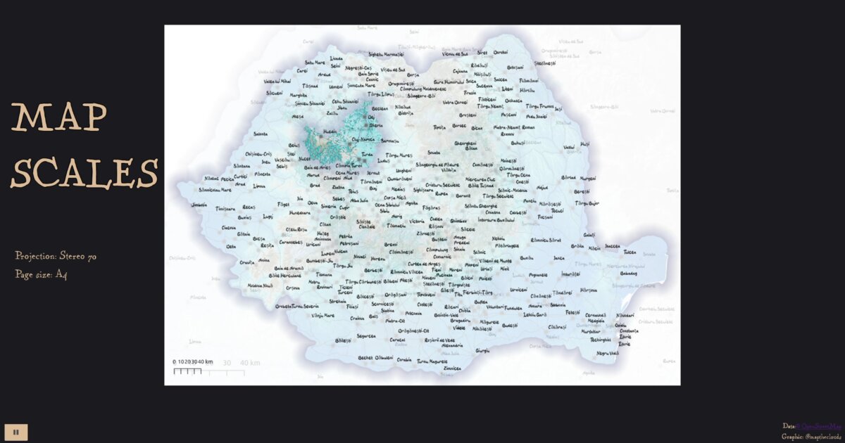
Day 17/100: Every map lies about scale 📏
This technical experiment explores how maps communicate distance across different levels of detail, from a national overview down to local topography.
The project transitions through a sequence of maps exported from QGIS, using Three.js shaders and GSAP to create smooth, fluid animations between scales. In digital environments, scale is not fixed. As we zoom, the relationship between pixels and real-world distance shifts continuously.
What I wanted to explore was not just zooming, but perception. Scale bars, representative fractions, and projections all try to anchor trust, yet in a dynamic web context they must constantly adapt. I used Romania’s national projection (Stereo 70) and a fixed A4 layout to highlight how cartographic compromises change with scale.
Cartographers have wrestled with this problem for centuries: how to represent a curved world on a flat surface at a readable size. Good design doesn’t remove distortion, it makes it visible.
More of a technical experiment than a finished product, this project explores how scale communication behaves in interactive, browser-based maps. 🗺️
Live demo: Map scales
Data sources: OSM (roads, water, towns), EU-DEM (elevation)
Inspiration: Evelyn Nuuemaa’s fantasy map style
The project
After population extrusion on a globe (Day 16), Day 17 stays in the browser but asks a quieter cartographic question: what does scale mean when zoom is continuous?
| Piece | Role |
|---|---|
| QGIS exports | Fixed A4 layouts at successive scales |
| Stereo 70 | Romania national projection |
| Three.js shaders + GSAP | Transitions between those frames |
| OSM + EU-DEM | Roads, water, towns, elevation |
Scale bars and representative fractions must adapt as pixel-to-ground distance changes. The experiment makes that adaptation visible.
Why this day matters in the series
Good design does not erase distortion. It surfaces the compromise. Day 12 showed projection choice; Day 17 shows scale choice under motion.
How to follow
- Blog: blog.maptheclouds.com
- LinkedIn: Day 17 post
- Live demo: map-scales
- Previous: Day 16 – World cities population
- Hashtag: #100DayMapChallenge
#100DayMapChallenge · Day 17/100 · Map scales · LinkedIn
Previous: Day 16: Higher Bars Mean More People