
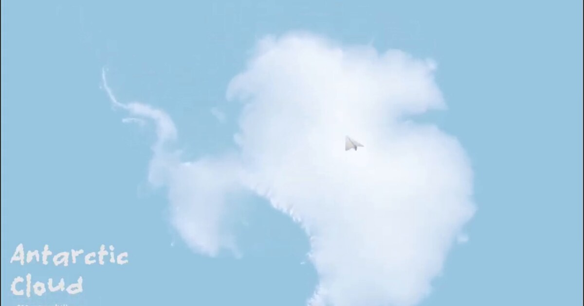
Day 6: Antarctica doesn’t look like this (but what if it did?) ❄️☁️
I took 200-meter resolution elevation data from the Radarsat Antarctic Mapping Project and rendered it in Three.js with a twist: instead of using traditional ice or rock textures, I made it look like fluffy clouds.
This was pure visual experimentation. Antarctica’s terrain is vast, dramatic, and mostly hidden beneath kilometers of ice. The elevation data captures the topography of the ice surface itself. By rendering it as clouds rather than solid terrain, I wanted to explore perception and reinterpret familiar spatial relationships. 🏔️
Workflow: QGIS to process the raster, export as an image, then Three.js for rendering with fly navigation. The soft, cloud-like appearance comes from a transparent texture layered over the surface. The result doesn’t resemble a traditional map, yet the spatial structure remains intact. ☁️
Sometimes maps don’t need realism. Sometimes looking at data in an unfamiliar way reveals patterns you wouldn’t notice otherwise.
Live demo: Antarctic Cloud · Video: YouTube
The project
After a week of LiDAR pipelines and operational GIS (Days 2-5), Day 6 is a perception experiment. The geometry is still Antarctic ice-surface elevation. The reading is not.
Data: Radarsat Antarctic Mapping Project Digital Elevation Model Version 2 (RAMP), 200 m resolution, accessed via Quantarctica / NSIDC lineage. The DEM describes the ice surface, not bedrock beneath kilometers of ice.
Workflow
| Step | Tool | Output |
|---|---|---|
| 1 | QGIS | Process elevation raster, export image |
| 2 | Three.js / WebGL | Mesh + fly navigation |
| 3 | Transparent texture | Soft cloud appearance over the surface |
Structure stays geographic. Appearance does not. That gap is intentional.
Why clouds
Traditional ice or rock textures push the eye toward “terrain as ground.” A cloud texture asks whether form is still readable when material cues change. For a continent-scale DEM, that question is useful: at 200 m, the interesting signal is broad relief, not photographic realism.
Tools and references
- QGIS: raster prep and image export
- Three.js / WebGL: interactive fly-through
- RAMP DEM v2: Liu et al., NSIDC DAAC
- Quantarctica: project data context via Norwegian Polar Institute
Score in the campaign mapping: 57 points (strong visual / experimental piece in the GIS foundations phase).
Why this day matters in the series
Days 1-5 built accuracy, pipelines, and operational maps. Day 6 tests whether cartography can keep spatial honesty while dropping visual convention. That tension shows up again later in more abstract Three.js work.
How to follow
- Blog: blog.maptheclouds.com
- LinkedIn: Day 6 post
- Live: Antarctic Cloud demo
- Previous: Day 5 – Dublin LiDAR
- Hashtag: #100DayMapChallenge
#100DayMapChallenge · Day 6/100 · Antarctica clouds · LinkedIn
Previous: Day 5: Point Clouds Cross Borders