
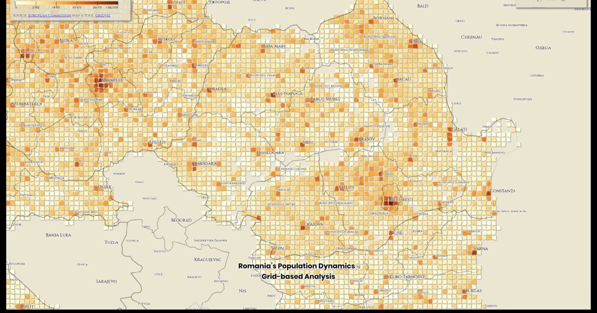
Day 29. Romania’s population as a mosaic 🇷🇴
How do you show population density when a traditional choropleth map hides more than it reveals?
This visualization takes a grid-based approach using Gridviz, a library designed for this type of spatial representation. Instead of administrative units, each cell represents population data from the European Commission, with color indicating density. The result is a mosaic that makes spatial structure easier to read.
Urban centers and development corridors become immediately visible, while large rural areas fade into lower-density fields. By removing irregular administrative boundaries, the grid highlights continuity and contrast across space.
I used Gridviz for the layout, and D3.js for color interpolation. This technique works well when representing continuous phenomena without anchoring interpretation to political borders.
Week 5 begins.
Live demo: Romania mosaic
The project
| Piece | Role |
|---|---|
| Library | Gridviz + D3 color interpolation |
| Data | European Commission population grids |
| Why grid | Continuous density without political borders |
| Week | Week 5 begins |
How to follow
- Blog: blog.maptheclouds.com
- LinkedIn: Day 29 post
- Live demo: Romania mosaic
- Previous: Day 28: EU Migration Chord
- Hashtag: #100DayMapChallenge
#100DayMapChallenge · Day 29/100 · LinkedIn
Previous: Day 28: EU Migration Chord