
Day 48. Global wind forecast 🌬️
Wind becomes readable when direction, intensity, and motion move together.
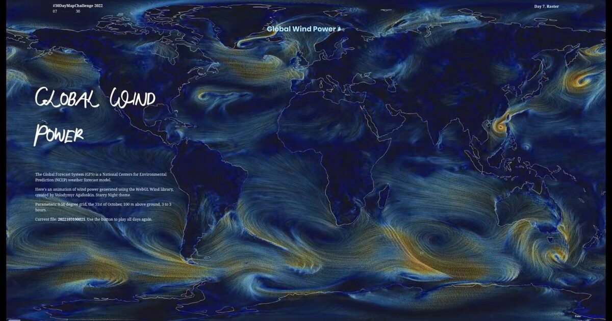
Across the globe, currents unfold as continuous flow, replacing static arrows with something closer to breath. Patterns don’t appear all at once, they emerge through motion.
The visual language draws from The Starry Night: deep cobalt and ultramarine blues wrapped around the planet, interrupted by luminous yellows and soft whites. Wind paths drift like brushstrokes, turning invisible forces into light and movement.
This atmosphere is not just aesthetic. It creates depth, contrast, and rhythm, helping global circulation patterns become legible at a glance.
Behind it sits time-stepped wind data from the NCEP Global Forecast System (GFS), using a 0.50° grid at 100 m above ground, sampled at 3-hour intervals (2022-10-31). Raster fields (JSON + PNG textures) are animated using the WebGL Wind approach by Volodymyr Agafonkin, running a GPU-based particle simulation where behaviour updates continuously with each timestep.
The challenge was keeping clarity while rendering hundreds of thousands of particles, balancing density and fade so motion reveals structure instead of noise. The result is not just a forecast, but a living atmosphere in motion, where wind reads like light across a night sky.
Live demo: Windy Sky
The project
| Piece | Role |
|---|---|
| Data | NCEP GFS 0.50 deg, 100 m AGL, 3-hour steps |
| Engine | WebGL Wind (Volodymyr Agafonkin) GPU particles |
| Style | Starry Night palette: cobalt, yellow, white strokes |
| Challenge | Particle density vs clarity at global scale |
How to follow
- Blog: blog.maptheclouds.com
- LinkedIn: Day 48 post
- Live demo: Windy Sky
- Hashtag: #100DayMapChallenge
#100DayMapChallenge · Day 48/100 · LinkedIn
Previous: Day 47: Atmosphere