
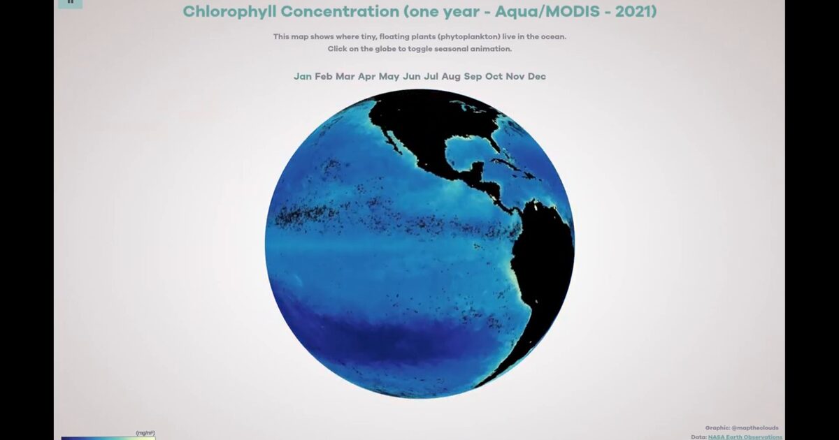
Day 45. Chlorophyll ocean data 🌊
Some datasets only become meaningful when time, motion, and context are seen together.
This interactive globe explores one year of NASA Aqua/MODIS chlorophyll data, where monthly ocean patterns reveal how phytoplankton distribution shifts seasonally. The goal was not just to show the data, but to make the transitions readable through motion.
The main challenge was keeping smooth transitions across 12 monthly frames while preserving data integrity. Built with Three.js and WebGL, the project uses custom GLSL shaders for two key elements: a vignette pass to guide visual focus, and a time-based transition that interpolates between months without hard cuts.
Click interaction toggles between animated and static views, making it easier to read both the overall flow and individual states.
The project was selected for the IIB Awards 2023 and remains one of my clearest examples of scientific storytelling through shader-driven animation.
Live demo: Chlorophyll Globe
The project
| Piece | Role |
|---|---|
| Data | NASA Aqua/MODIS chlorophyll, 12 monthly frames |
| Shaders | Vignette + time-based month interpolation |
| UX | Click toggles animated vs static view |
| Award | IIB Awards 2023 selection |
How to follow
- Blog: blog.maptheclouds.com
- LinkedIn: Day 45 post
- Live demo: Chlorophyll Globe
- Hashtag: #100DayMapChallenge
#100DayMapChallenge · Day 45/100 · LinkedIn
Previous: Day 44: Earth Gone Wild
Next: Day 46: Virtual Land Map