
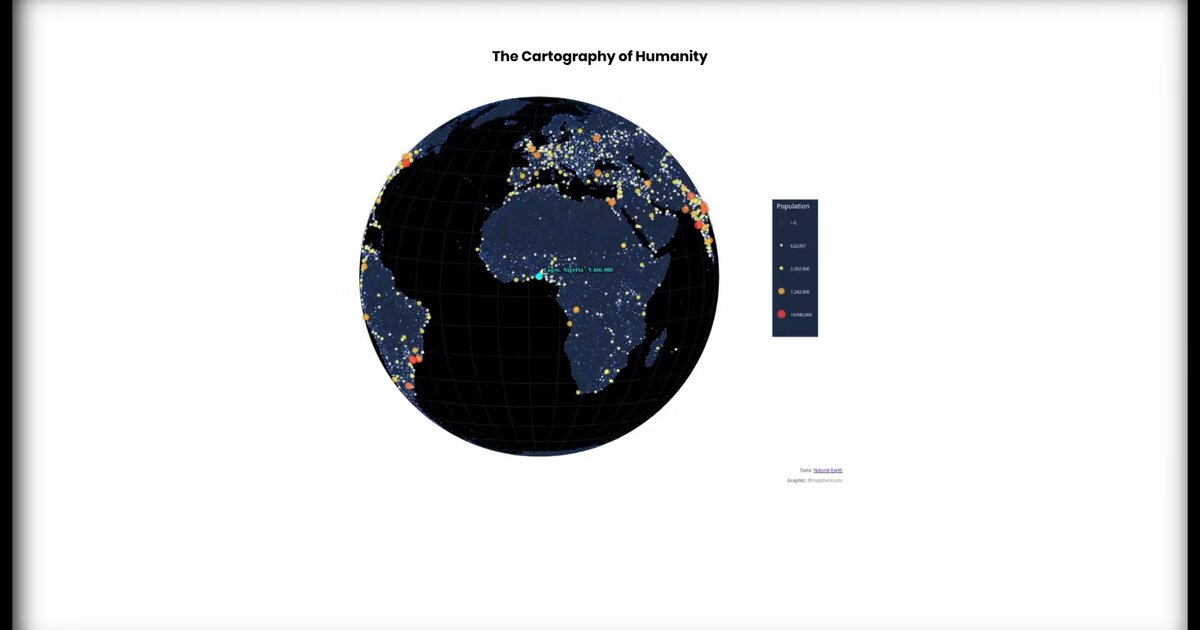
Day 37. Populated places rendered by size and rank 🌐
How do you visualize global settlement patterns without letting political boundaries dictate the story?
This project maps populated places across Earth using circle size to represent population and brightness to indicate rank. Larger circles mean more people. Brighter colors signal higher-ranked cities. By removing country borders and administrative divisions, the structure of settlement becomes visible on its own terms.
Built in D3.js and rendered on canvas for performance, the visualization handles thousands of points smoothly. To keep interaction responsive, city selection uses a quadtree spatial index. Instead of checking every point linearly, the data is organized hierarchically, making click detection significantly faster.
What emerges is a clear spatial hierarchy: megacities, regional centers, and the vast spaces between them. Coastal concentration. River valleys. Infrastructure corridors. Patterns shaped by geography and history rather than administrative logic.
Data: Natural Earth. Quadtree optimization inspired by Alain Roan’s Observable work on speeding up zoom with many points. Interaction approach informed by D3 canvas globe discussions.
Live demo: Populated places
The project
| Piece | Role |
|---|---|
| Encoding | Size = population; brightness = rank |
| Render | D3 + canvas for thousands of points |
| Pick | Quadtree spatial index |
| Data | Natural Earth |
How to follow
- Blog: blog.maptheclouds.com
- LinkedIn: Day 37 post
- Live demo: Populated places
- Hashtag: #100DayMapChallenge
#100DayMapChallenge · Day 37/100 · LinkedIn
Previous: Day 36: Valuable Vinyl Voronoi