
Day 22. When you need to see relationships and geography 🦠
Yesterday showed daily bar charts. How many cases, over time. Today asks a different question. Not how many, but who infected whom, and where?
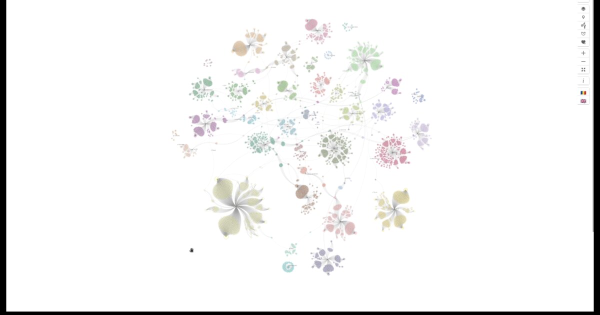
This is a variant of a network diagram I built in March 2020, grouped by county and by source case. Each circle represents a person. Size shows how many others they infected. Colour can represent status, county, gender, or age, depending on the lens you choose.
Curved lines show transmission chains. When the source of an infection was known, that became a connection. A force simulation distributes the nodes, creating clusters that reveal possible outbreak hotspots.
What made this view essential was the county grouping. Health responses were organised administratively, county by county. A superspreader event inside one county appears as a tight cluster. Cross-county transmission appears as bridges between groups. Geography matters when resources are allocated along administrative boundaries.
The technical challenge was performance. D3 force layouts were not designed for thousands of nodes. The DOM could not cope. I tried Canvas rendering, web workers for pre-calculation, and even server-side SVG generation with Node.js. What worked was pre-calculating the simulation in the backend, injecting SVG, and binding data only for interaction.
Interaction was critical. Hover reveals contact counts and links to source articles. Zoom reveals labels. Pan navigates. Themes switch between county, gender, age, and status. Languages toggle between Romanian and English.
The data updated daily, provided by the geo-spatial.org volunteer team.
Tomorrow: the same cases, arranged by time instead of space. A different question, a different insight.
Data sources: geo-spatial org API
Live demo: COVID cases by county (EN)
The project
| Piece | Role |
|---|---|
| Layout | Force simulation grouped by county / source case |
| Encoding | Size = secondary infections; color = status/county/gender/age |
| Perf | Backend pre-calc + SVG inject; bind data for interaction only |
| Data | geo-spatial.org API, updated daily |
Note
Live LinkedIn date is 2 March 2026; campaign draft header said March 3. Blog uses live.
How to follow
- Blog: blog.maptheclouds.com
- LinkedIn: Day 22 post
- Live demo: COVID cases by county (EN)
- Previous: Day 21: COVID Daily Cases Romania
- Hashtag: #100DayMapChallenge
#100DayMapChallenge · Day 22/100 · LinkedIn
Previous: Day 21: COVID Daily Cases Romania