
Day 34. Historical timelines as a comparison tool
When events unfold at different speeds, how do you make them comparable without distorting their duration or significance?
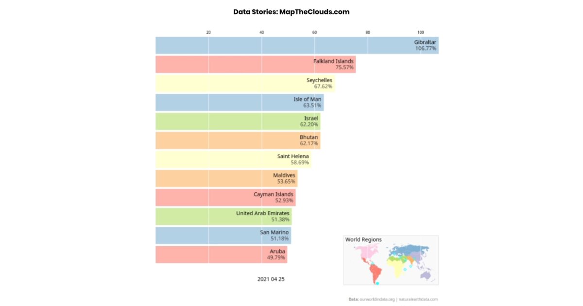
This visualization looks at the global race for COVID-19 vaccination as of April 25, 2021. Each bar represents the share of the total population in a country that received at least one vaccine dose since the start of its rollout. Colors indicate world regions.
Rather than focusing on a single moment, the format allows multiple timelines to be read in parallel. Patterns of acceleration, delay, and overlap become visible without compressing events into a single metric. The real challenge with historical data is not plotting points on a timeline, but deciding what to include, how to handle uncertainty, and whether linear time is always the right scale.
Built with D3.js for layout and interaction, the design favors clarity over decoration: simple bars, clear labels, consistent spacing. The goal is comparison without cognitive friction.
Inspired by Mike Bostock’s Bar Chart Race, this adaptation applies animated ranking to temporal data. Timelines remain one of the most effective tools for understanding sequence and scale, as long as they do not try to do too much.
Data from ourworldindata.org and naturalearthdata.com.
Live demo: Historical timelines / vaccination race
The project
| Piece | Role |
|---|---|
| Subject | Share with ≥1 dose by country (to 2021-04-25) |
| Format | Parallel timelines / animated ranking |
| Inspiration | Mike Bostock Bar Chart Race |
| Data | ourworldindata.org, naturalearthdata.com |
How to follow
- Blog: blog.maptheclouds.com
- LinkedIn: Day 34 post
- Live demo: Historical timelines / vaccination race
- Hashtag: #100DayMapChallenge
#100DayMapChallenge · Day 34/100 · LinkedIn
Previous: Day 33: California BDR 3D
Next: Day 35: Earth in Lines