
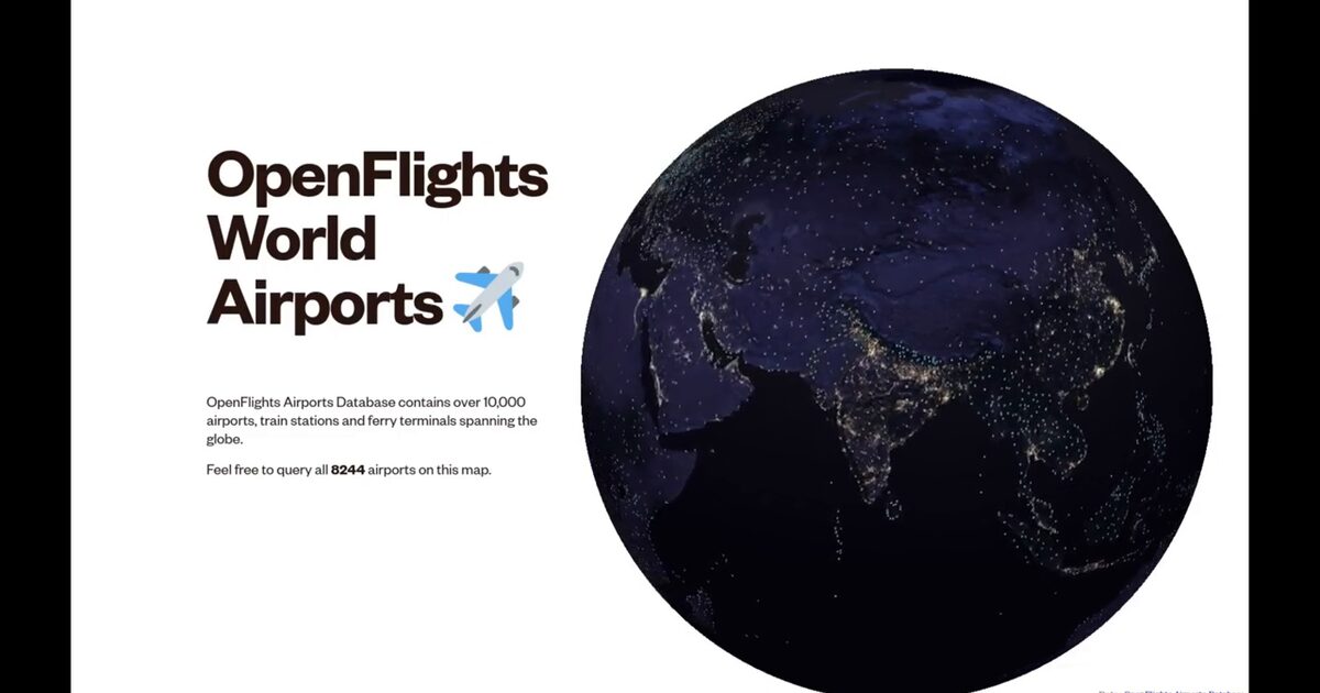
Day 43. OpenFlights World Airports ✈️
Week 6 begins with a question about scale: what happens when you map more than 8,000 airports as a single interactive dataset?
Using the OpenFlights Airports Database, this visualization renders global aviation infrastructure as queryable points on a 3D globe. Each marker represents an airport, while filtering by region reveals continental coverage and the uneven distribution of connectivity.
Built entirely with Three.js and WebGL, the real challenge is performance. Plotting points is easy, but keeping thousands of elements interactive is not. InstancedMesh keeps rendering efficient by grouping markers into a single draw call, while GLSL shaders add subtle visual feedback. CSS2DObject overlays airport information in 3D space, and Raycaster enables smooth selection across thousands of instances.
What emerges is more than a network. It’s a pattern of infrastructure inequality: dense clusters across North America, Europe, and parts of Asia, contrasted with large regions that remain sparsely connected. The map doesn’t explain the causes, but it makes the imbalance visible.
The OpenFlights database remains one of the most comprehensive open datasets for global aviation infrastructure.
Live demo: OpenFlights World Airports
The project
| Piece | Role |
|---|---|
| Data | OpenFlights Airports Database (8,000+ sites) |
| Perf | InstancedMesh single draw call |
| UX | Raycaster selection; CSS2DObject labels; region filter |
| Read | Dense hubs vs sparse connectivity regions |
How to follow
- Blog: blog.maptheclouds.com
- LinkedIn: Day 43 post
- Live demo: OpenFlights World Airports
- Hashtag: #100DayMapChallenge
#100DayMapChallenge · Day 43/100 · LinkedIn
Previous: Day 42: SA Rivers Flow Network
Next: Day 44: Earth Gone Wild