
Day 24. Time changes everything 🦠
Same cases. Same connections. But arranged by when they were confirmed, not where they happened or who they were connected to.
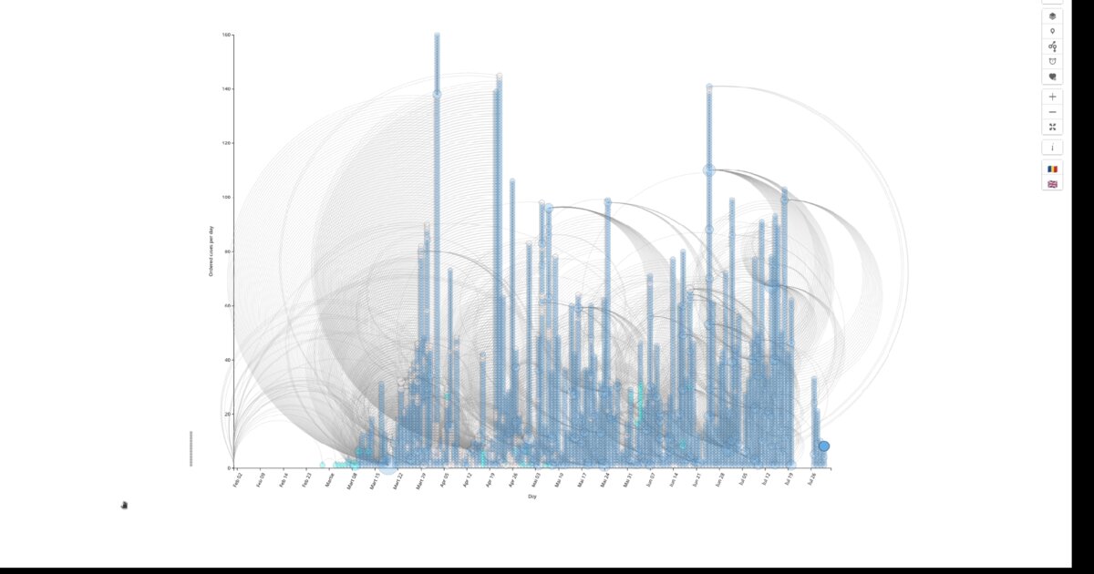
The x-axis shows the day of confirmation. The y-axis stacks cases chronologically within each day. Circle size represents how many others that person infected. Curved arcs show transmission links across time.
This is a hybrid view. A bubble chart combined with an arc diagram. Why this mattered was velocity. Network diagrams show relationships. Maps show geography. Neither shows how fast transmission unfolds.
The timeline revealed acceleration points, where many secondary cases emerged from few sources. It showed lag patterns between a source case and confirmed contacts, shaped by incubation and testing delays. It showed whether clusters emerged simultaneously or cascaded over time.
For performance, I plotted positions directly. Day on the x-axis. Calculated order on the y-axis. Case count for diameter. Simpler and faster than a force layout.
The arcs make time gaps visible. A source case confirmed on Day 5 might lead to contacts confirmed on Days 8, 12, or 15. The arc spans those days.
Superspreader events did not always trigger immediate clusters. Sometimes secondary cases appeared 10 to 14 days later, then accelerated rapidly. The timeline made that lag visible in a way networks could not.
Tomorrow: geography again. Where outbreaks formed, stripped of time and relationships.
Data sources: geo-spatial org API
Live demo: COVID cases timeline (EN)
The project
| Piece | Role |
|---|---|
| X / Y | Confirmation day / stack order within day |
| Size / arcs | Secondary infections / transmission across time |
| Why | Velocity and lag, not just who or where |
| Perf | Direct plot, no force layout |
How to follow
- Blog: blog.maptheclouds.com
- LinkedIn: Day 24 post
- Live demo: COVID cases timeline (EN)
- Previous: Day 23: COVID Full Network
- Hashtag: #100DayMapChallenge
#100DayMapChallenge · Day 24/100 · LinkedIn
Previous: Day 23: COVID Full Network