
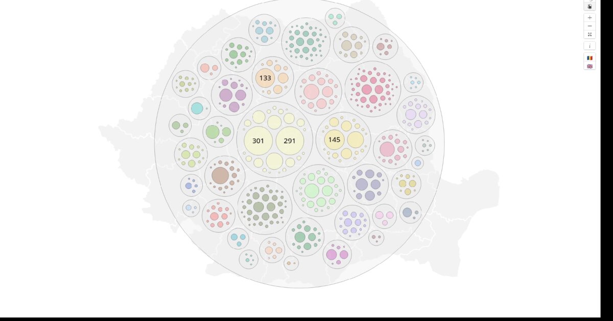
Day 25. Where are the outbreaks? 🦠
Networks showed relationships. Timelines showed velocity. Now, pure geography.
This view has two modes. A map view, with clusters placed over county boundaries. A pack view, where each county becomes a circle containing nested clusters. The map is intuitive, but overlapping areas hide detail. The pack layout sacrifices geography for clarity. Every cluster is visible.
I aggregated cases by source and placed clusters inside counties using D3’s circle pack layout. County geometries were converted to GeoJSON in QGIS, simplified, and bundled into a single TopoJSON file. Shared boundaries become arcs, reducing file size while preserving accuracy.
The clusters reveal hotspots. Tight circles indicate many cases from a single source. Dispersed circles suggest community transmission. Empty counties indicate no detected chains yet.
This was the fifth lens on the same dataset. Bars answered how many. Networks answered who. Timelines answered when. Maps answered where.
This is the final view in the COVID series. Tomorrow, we move beyond this dataset.
Five visualizations. One dataset. Different questions, different answers.
Data sources: geo-spatial org API ANCPI Geoportal (county geometries)
Live demo: COVID cases pack / map (EN)
The project
| Piece | Role |
|---|---|
| Modes | Map over counties; pack nested by county |
| Geom | QGIS GeoJSON → simplify → TopoJSON (ANCPI) |
| Encoding | Tight pack = single-source hotspot |
| Series | Fifth lens: how many / who / when / where |
How to follow
- Blog: blog.maptheclouds.com
- LinkedIn: Day 25 post
- Live demo: COVID cases pack / map (EN)
- Previous: Day 24: COVID Timeline Arcs
- Hashtag: #100DayMapChallenge
#100DayMapChallenge · Day 25/100 · LinkedIn
Previous: Day 24: COVID Timeline Arcs
Next: Day 26: SIRUTA Sunburst