This post is about the visualizations I’ve made on COVID-19 in Romania, and about data visualization in general.
If you are in a hurry, you can go straight to the graphs.
Well, 2020 was challenging, and changed many people’s lives. It was wrapped in fear, anger, suffering, loss, it brought out the worst in many of us. But it also helped us ask questions about our existence, our way of living, revealed empathy and brought people closer (in some ways).
The first COVID-19 case emerged in Romania on February 26th, 2020, there were 697898 confirmed cases to the moment of writing, and 17369 deaths (February 19’th 2021). On the 27th of December 2020, the vaccination began in Romania, too, as the first batches of Pfizer-BioNTech and Moderna vaccines arrived in our country.
So, even if SARS–CoV-2 is among us, I like to think that maybe there is hope. And also, that we would have learnt something from our mistakes, after a year of lockdowns, uncertainty and some unfortunate mistakes from our officials, that eventually segregated the people and widened the social gap.
I kept delaying to write a blog post, because is a sad topic, and it involves real people. Buy when I made those graphics, I thought that we were in this together, and maybe spotting a cluster of cases in my town could help me, as well as others, avoid the contamination, or prevent the spread. I felt the need to visualize the way the virus spread, to get a better understanding of the phenomenon, and also keep my mind busy.
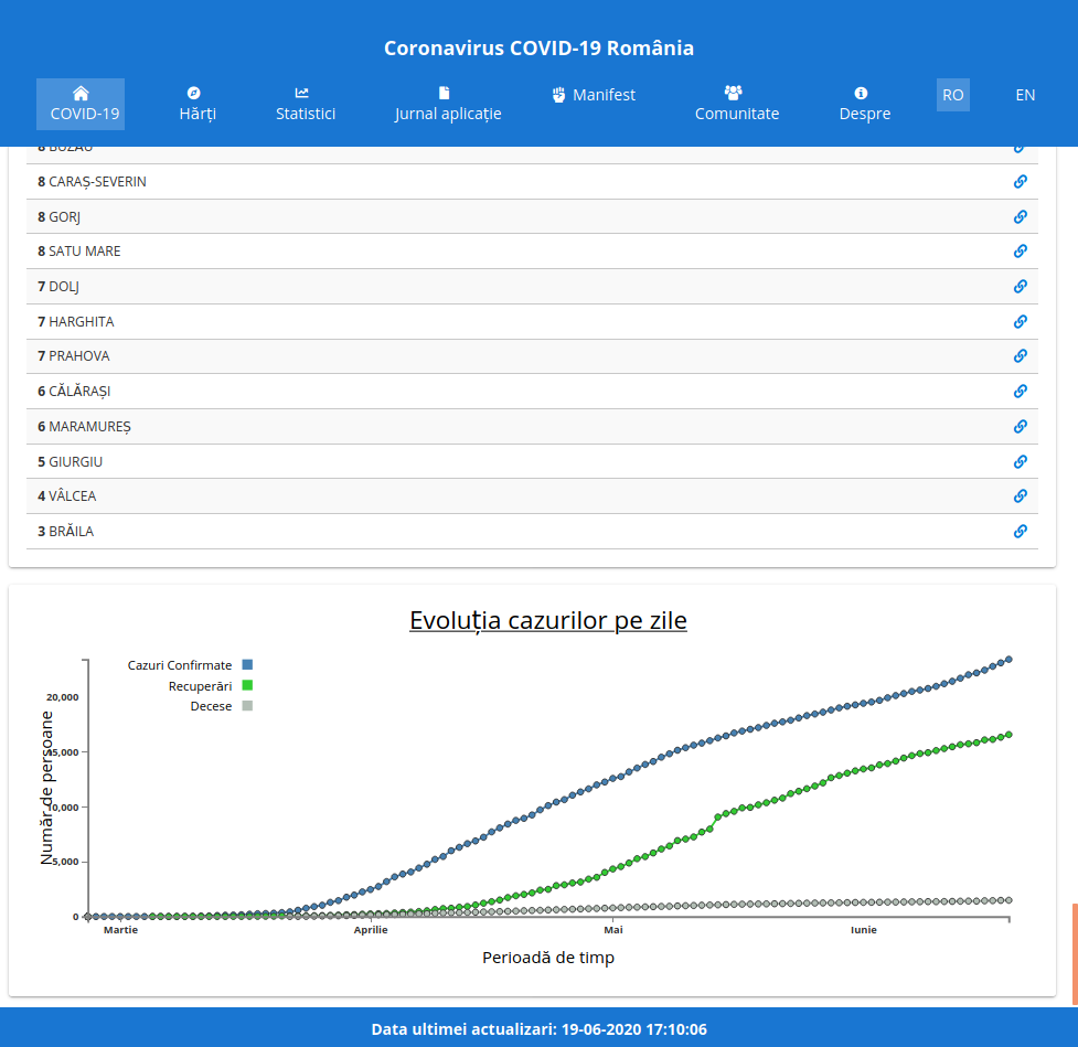
In February, the awesome people from the geo-spațial.org team decided to start monitoring the evolution of cases and the links between them. Together with the volunteers, they have started gathering data from the official government reports, daily, and enriched them with information from the media and other sources. Also, they have created Coronavirus COVID-19 România, an application that exposed the statistics through various maps, graphs and charts. The collected data was made available for free, as JSON, through an dedicated API.
Coronavirus COVID-19 România‘s struggle to provide accurate and complete data, in spite of the incomplete and delayed government reports, made me hope the officials would use the curated data and graphics to better manage the resources and prevent the spread. In my opinion, in the end no official cared about the data, the spatial patterns, or the predictions that statisticians have made.. But at least it brought a little more transparency on the data.
I offered to help the geo-spatial.org team on the data visualization side, I made an interactive graphic of the evolution of cases per day and published it on the website. At first, the code was integrated directly in the application, but after a while I decided to publish it on GitHub and expose it through gh-pages.
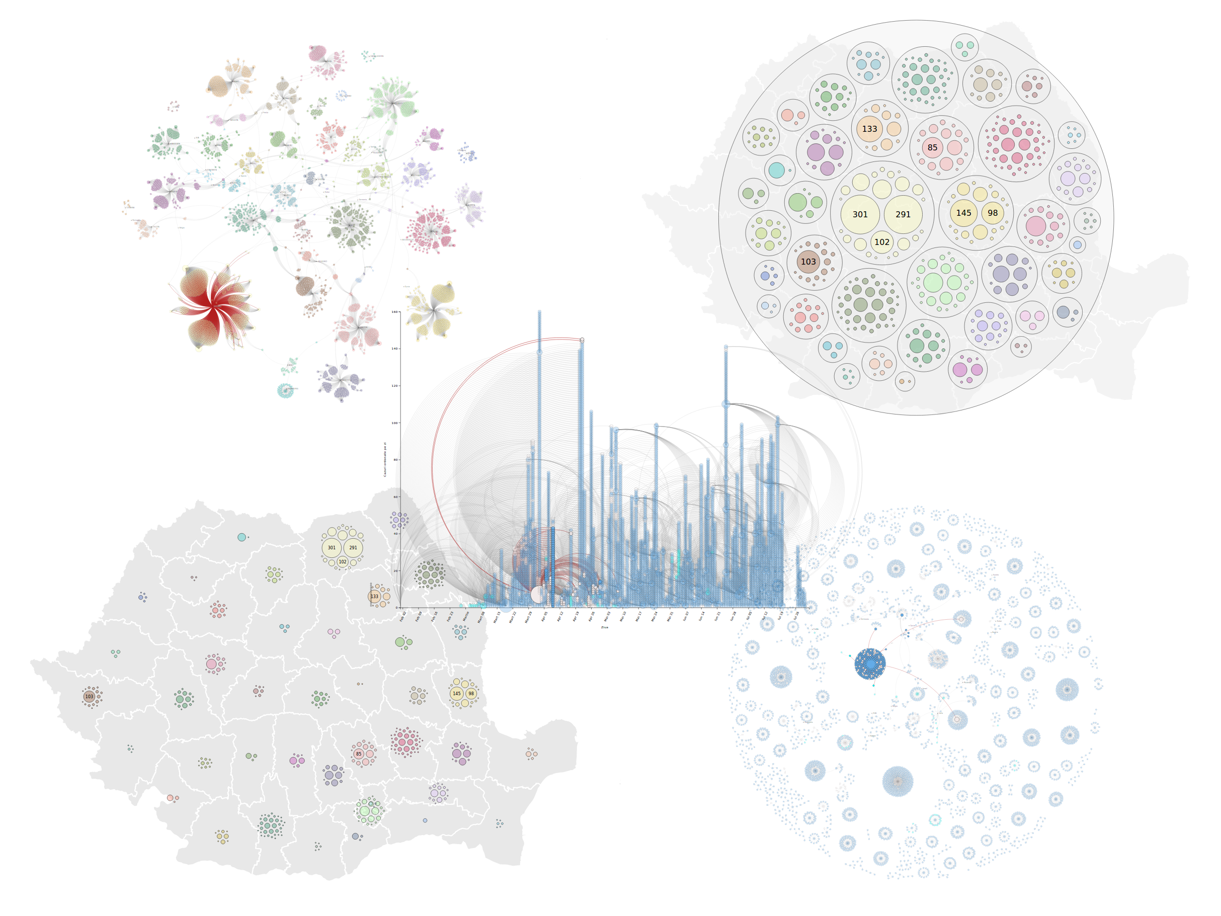
I’ve also made interactive graphics on the relationships between cases, a map that shows how are the cases clustered inside each county, a timeline that shows how are the cases related over time, and a treemap of the distribution of cases per county. Below, you can see some details about the graphics.
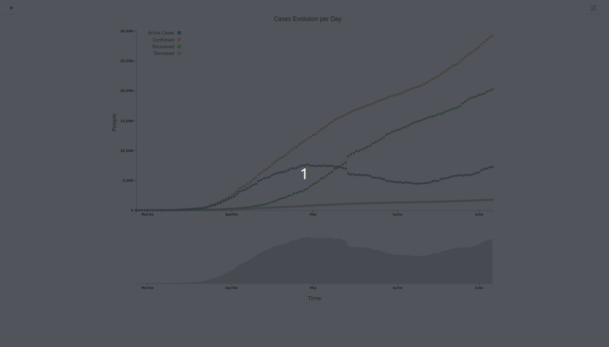
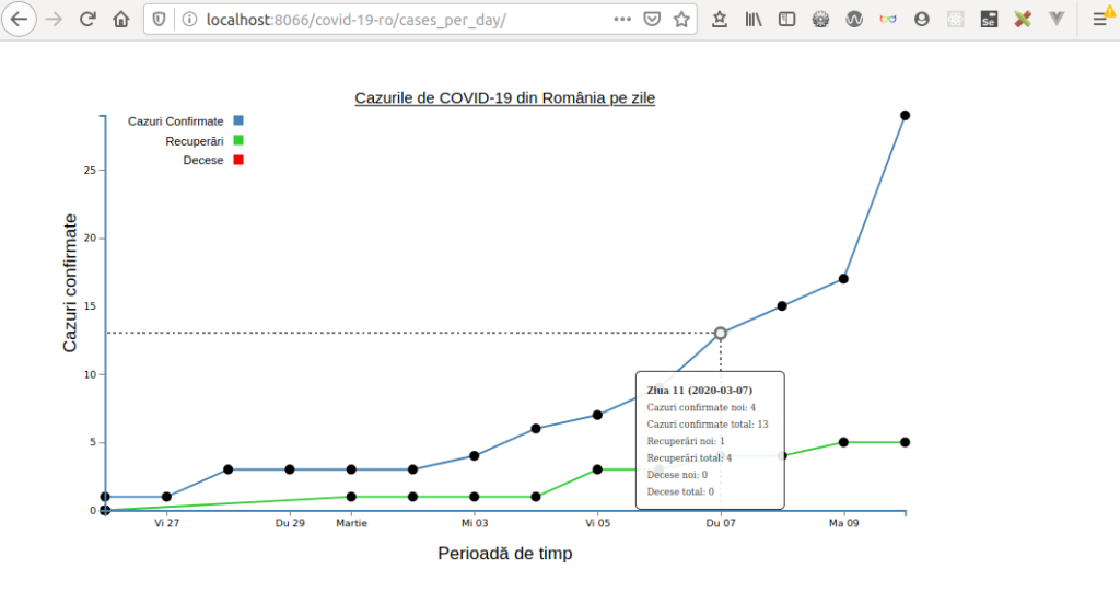
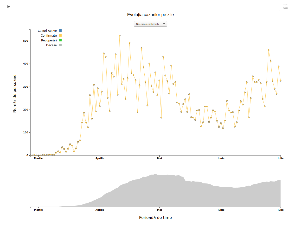
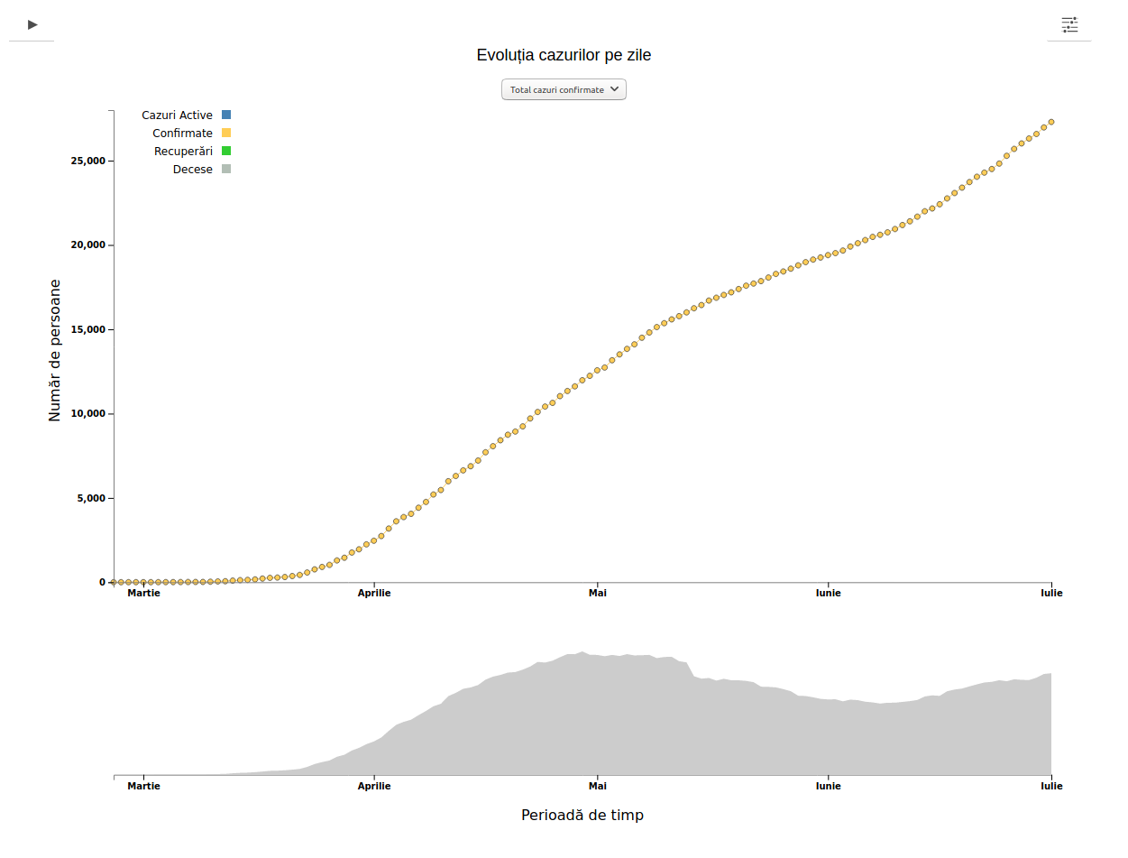
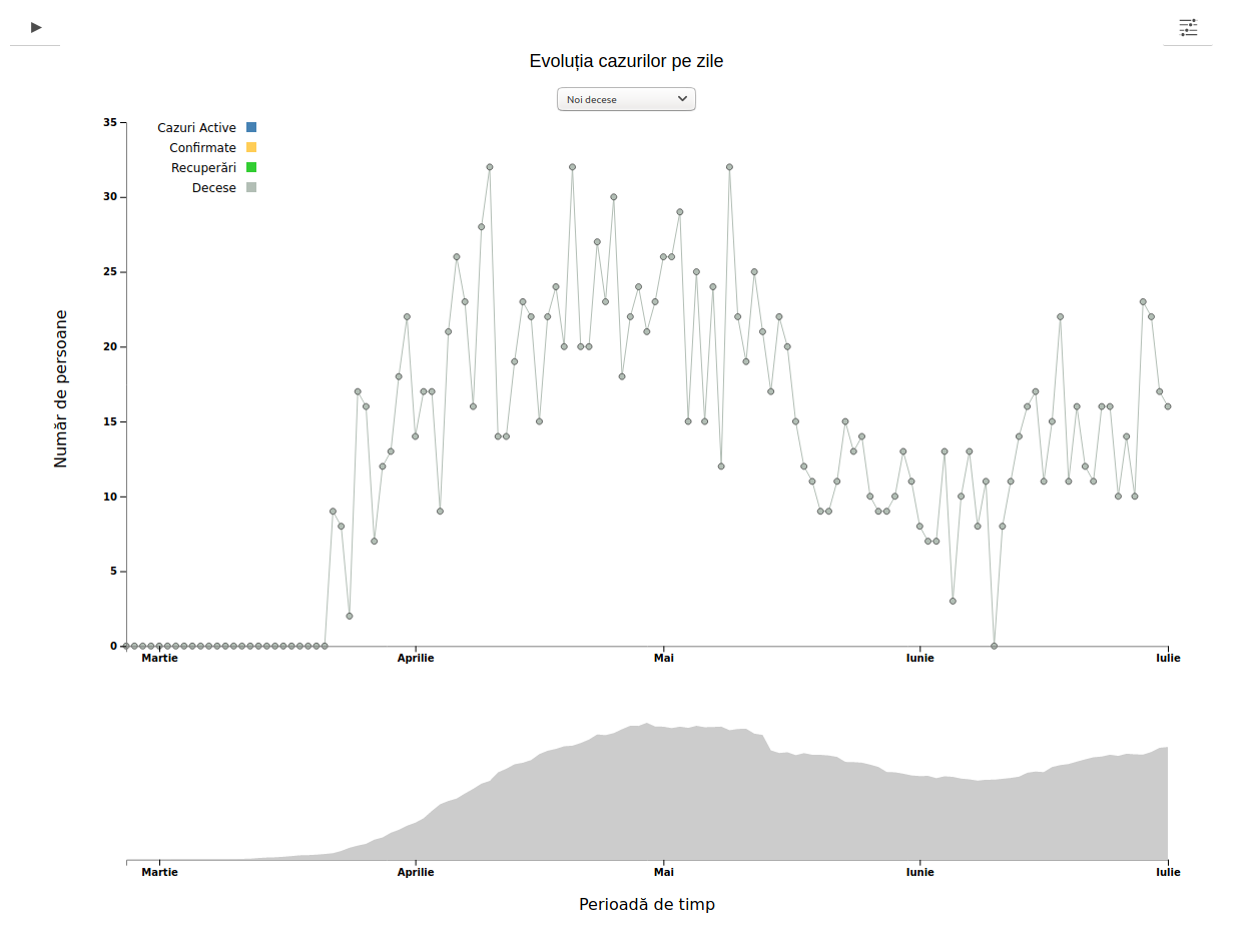
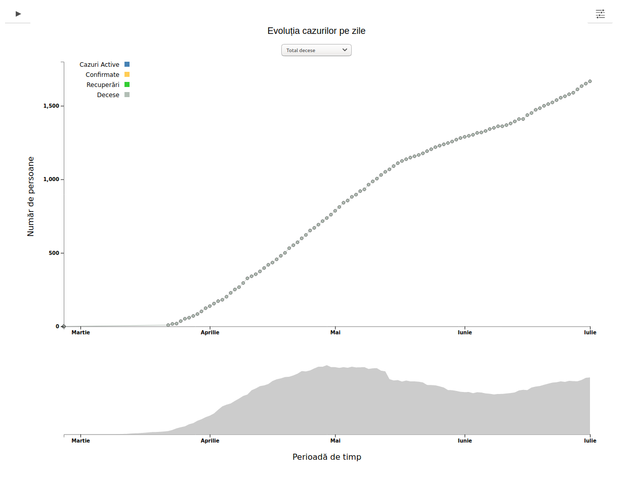
COVID-19 in România – Case numbers per day
Data source: https://covid19.geo-spatial.org/api/dashboard/getDailyCaseReport
Code: https://github.com/alexaac/covid-19-ro-cases-per-day
Live: https://maptheclouds.com/covid-19-ro/cases-per-day/en/ / https://covid19.geo-spatial.org/
Layout: line graph
Why did I make this graphic?
I wanted to monitor the case numbers change over the time.
This graphic is self-explanatory, it shows the evolution of the number of cases per day.
Line Graphs are used to display quantitative values over a continuous interval or time period. A Line Graph is most frequently used to show trends and analyse how the data has changed over time. (src)
I have used cumulative graphs, not logarithmic scales, but I have let the user select detailed graphs for smaller intervals of time.
On the cumulative graphs, each day’s data point is the sum total of all the previously confirmed cases. This is an excellent tool for visualizing the full extent of the outbreak so far. But the danger is that it makes things look much worse than they are, because the total number of confirmed cases since the beginning of the outbreak can only go up, not down. This method also makes it hard to see when growth rates are slowing, because you have to look for a plateau in the curve, rather than a drop. (src)
On a logarithmic scale, the graph’s vertical axis (y-axis) is graduated by orders of magnitude (1, 10, 100, 1,000) rather than in equal increments (10, 20, 30, 40). This basically “squashes” the y-axis so large numbers do not skew the whole graph. If an epidemic is growing exponentially, it arguably makes more sense to plot it this way because the trend line can “keep up” with the numbers instead of going straight up. One downside is that this is clearly a more abstract way of looking at the data, so you need to know how a log scale works before you can make meaningful sense of it. (src)
Implementation details
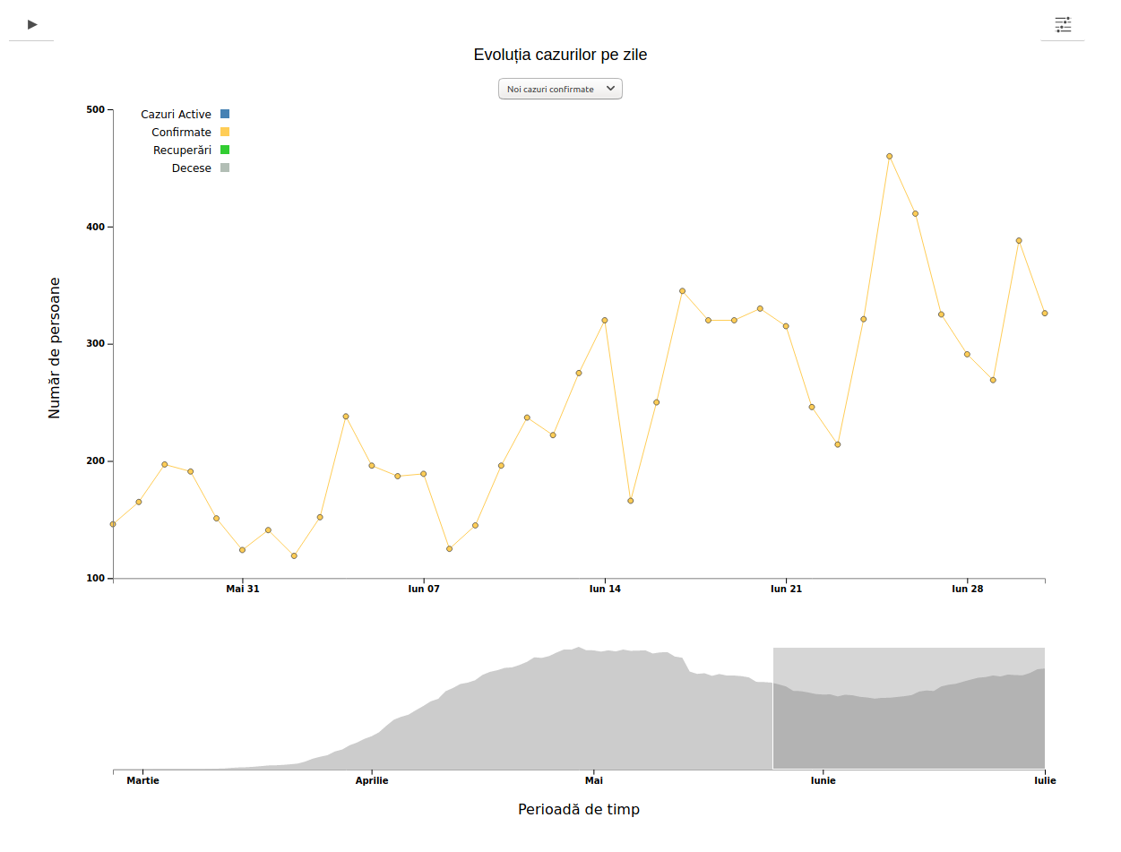
I have made three cumulative graphs, for confirmed, recovered and lost cases, and the user can see more information on hover. Later, I have added a graph for active cases, and a feature named brush, that lets the user select portions of the timeline on a area below the main graphs, so that the graphic would expose data only for the selected time interval.
The last features I’ve added were three more graphs for new cases per day, and a dropdown, initially hidden, that lets the user choose between graphs.
first look 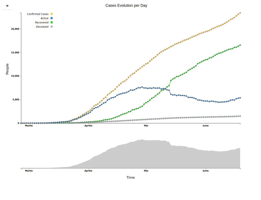
all 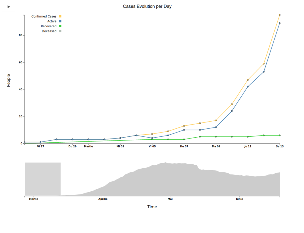
brush 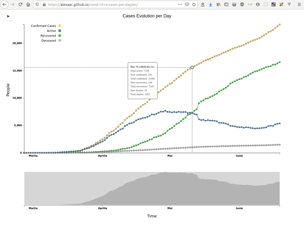
hover 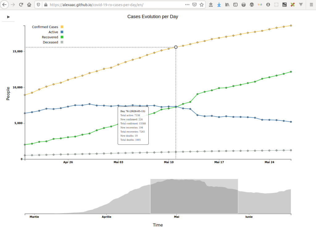
hover zoom 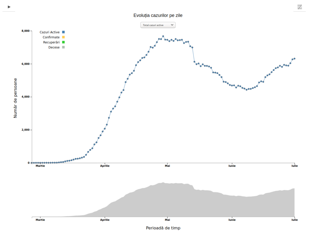
confirmed 
new active 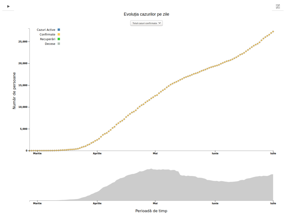
Active 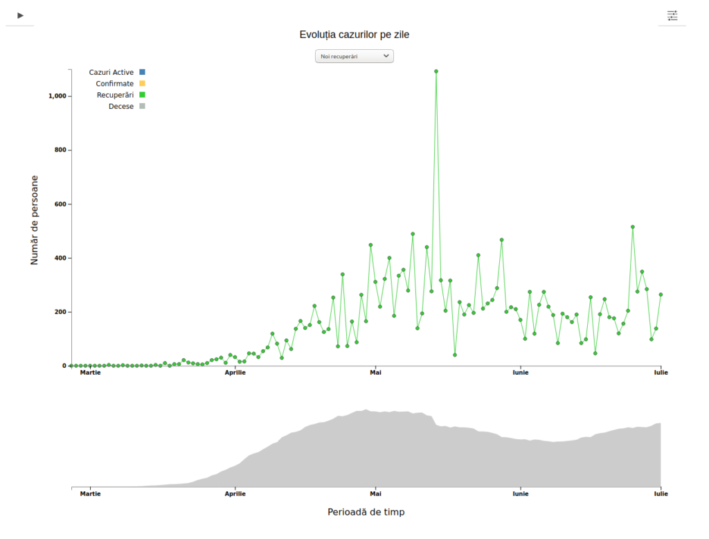
new recovered 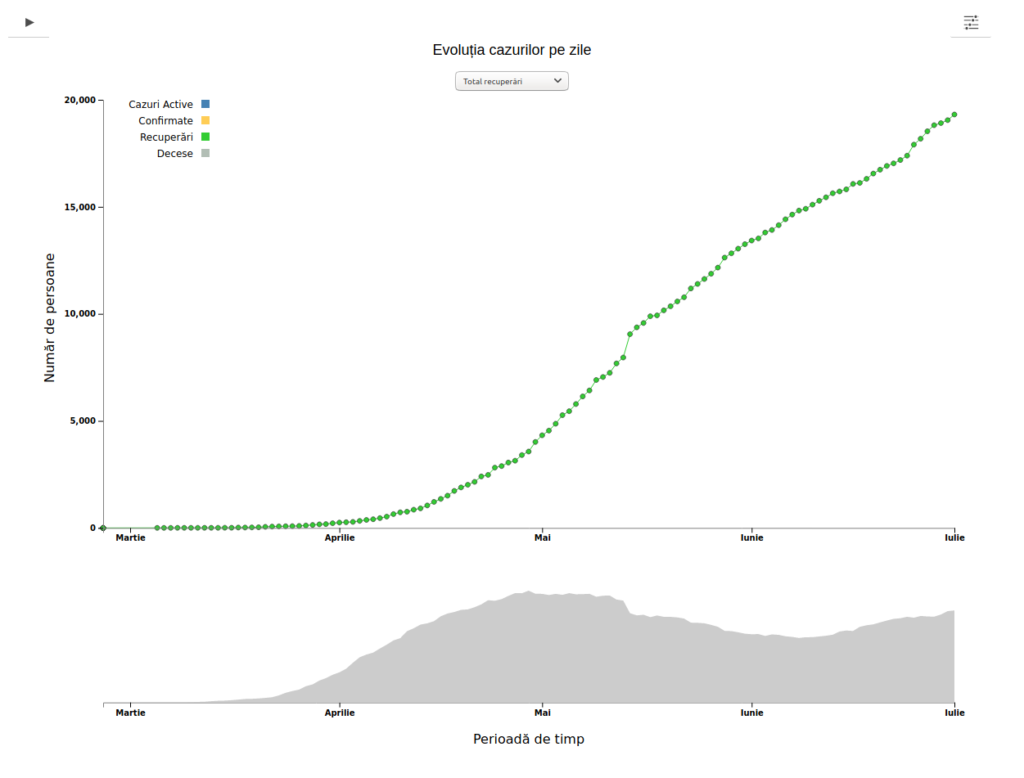
recovered 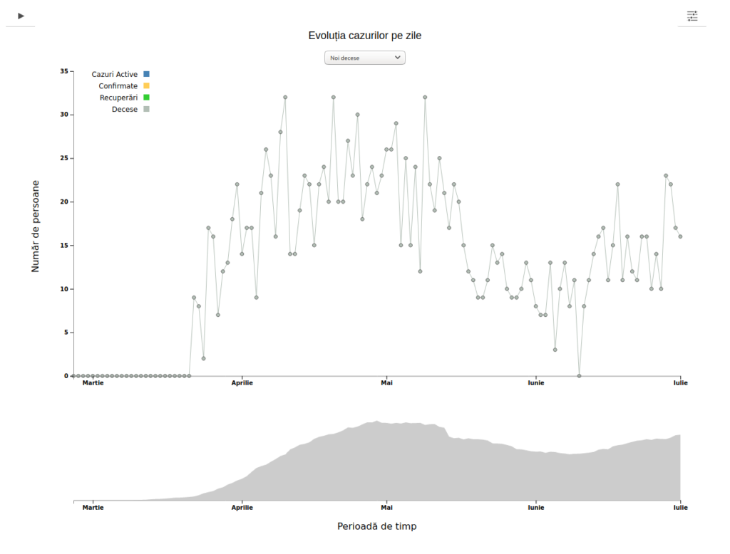
new lost 
lost 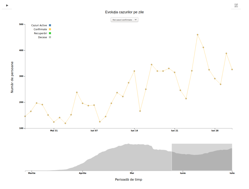
time interval


then 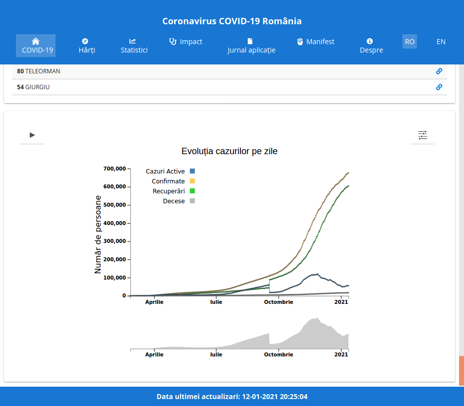
now
Further work
- Unit tests
- Make an alternate logarithmic scale
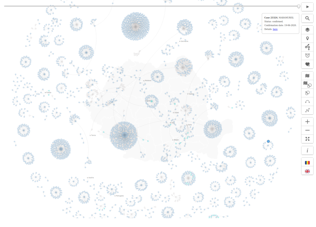
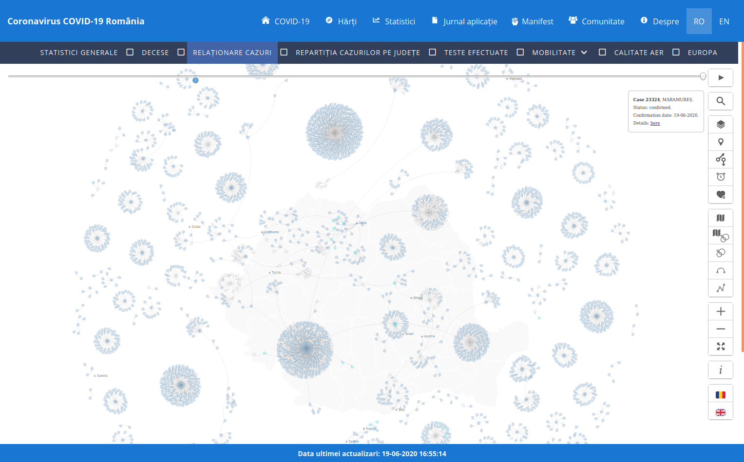
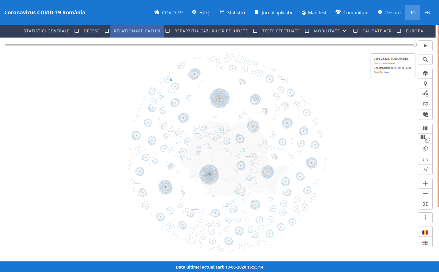
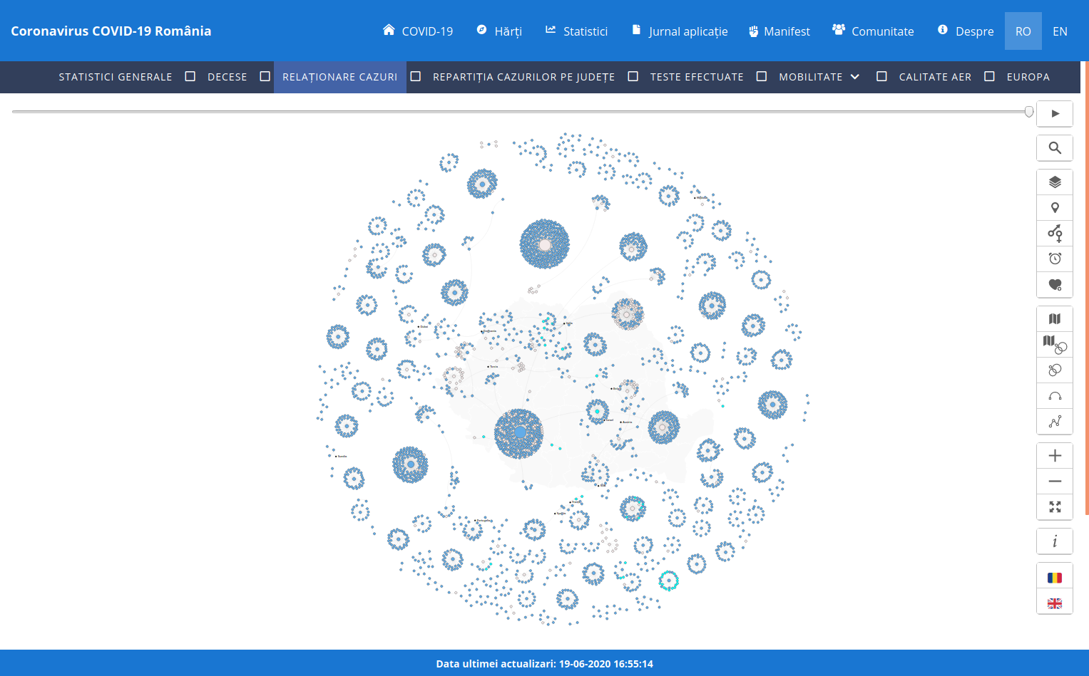
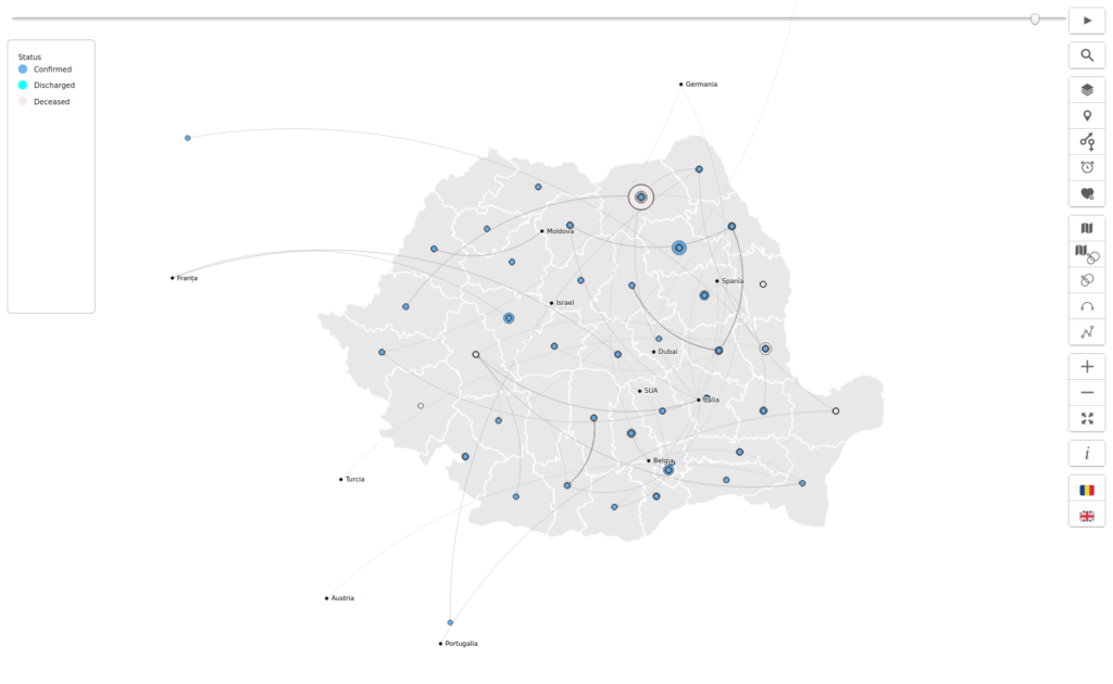
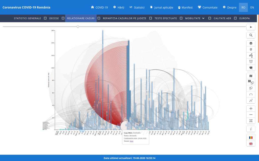
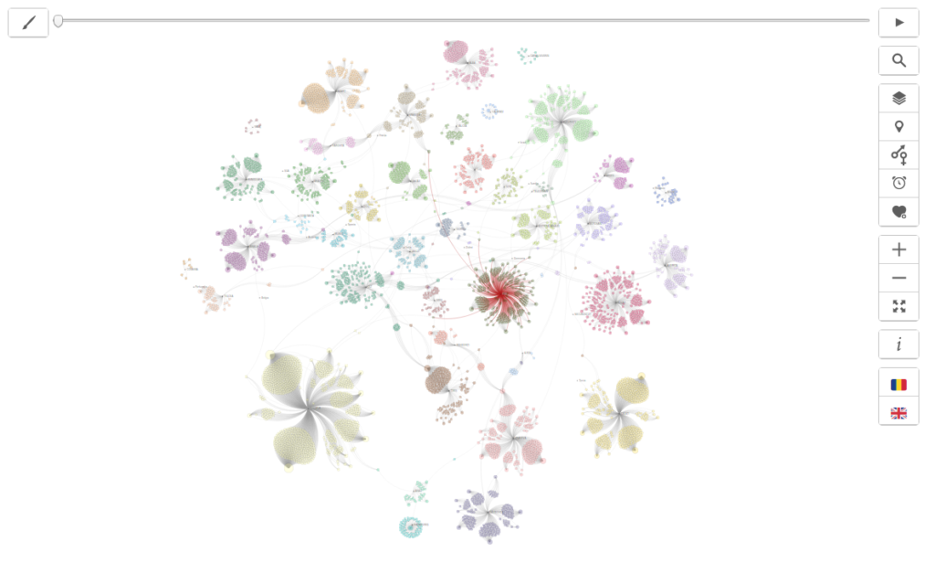
COVID-19 in România – Relationship between cases
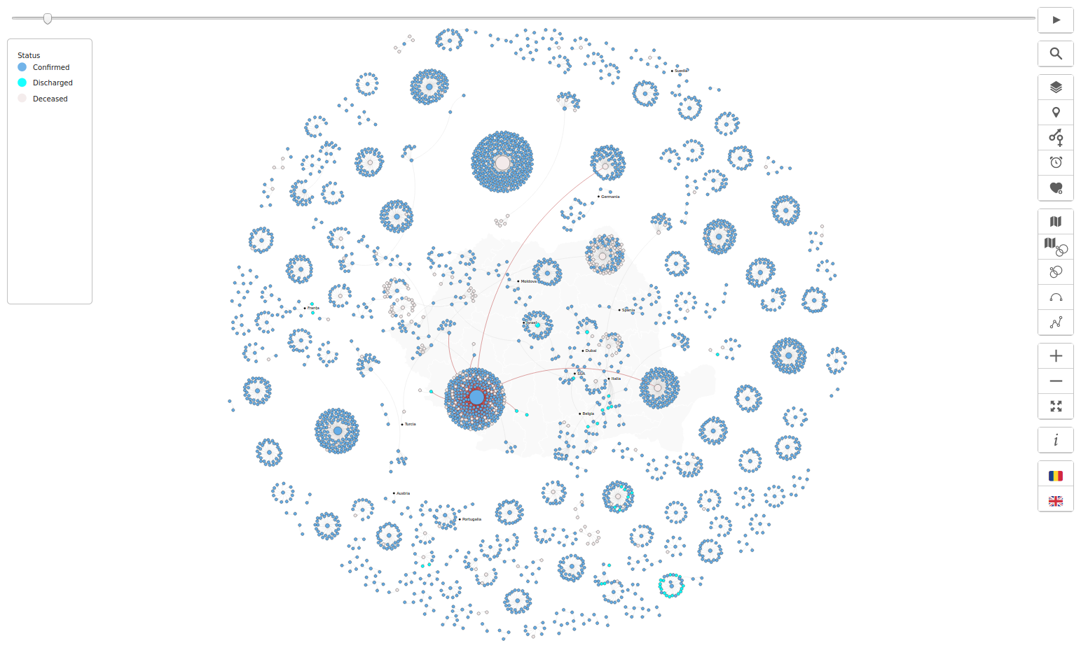
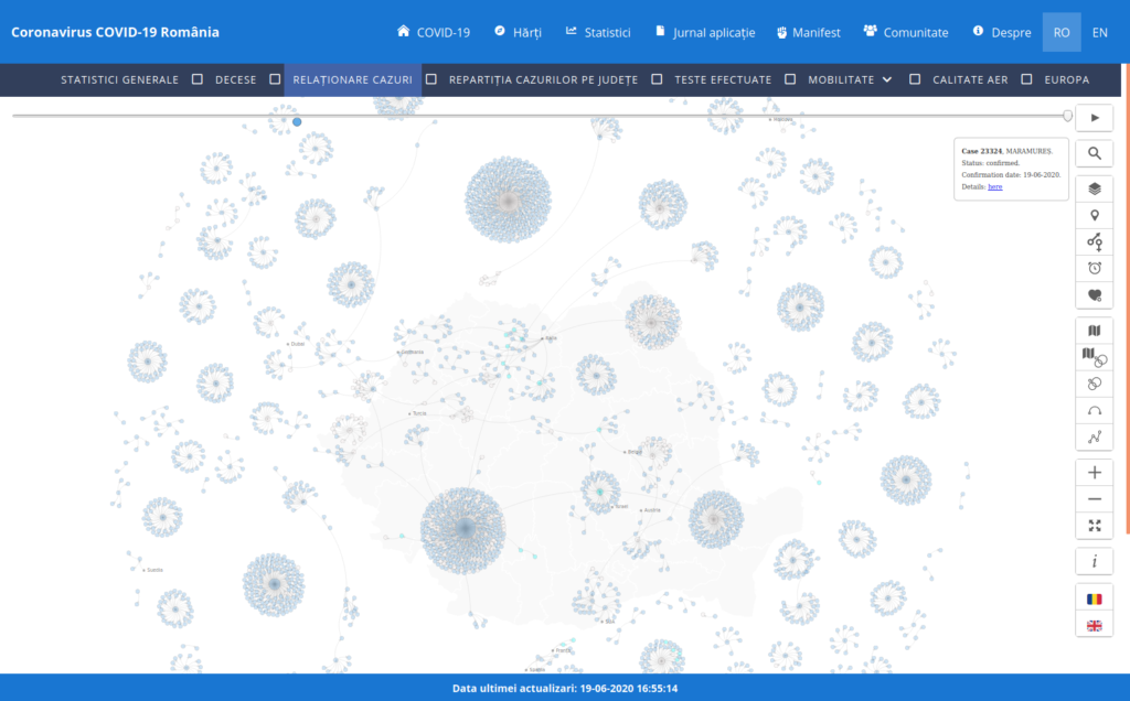
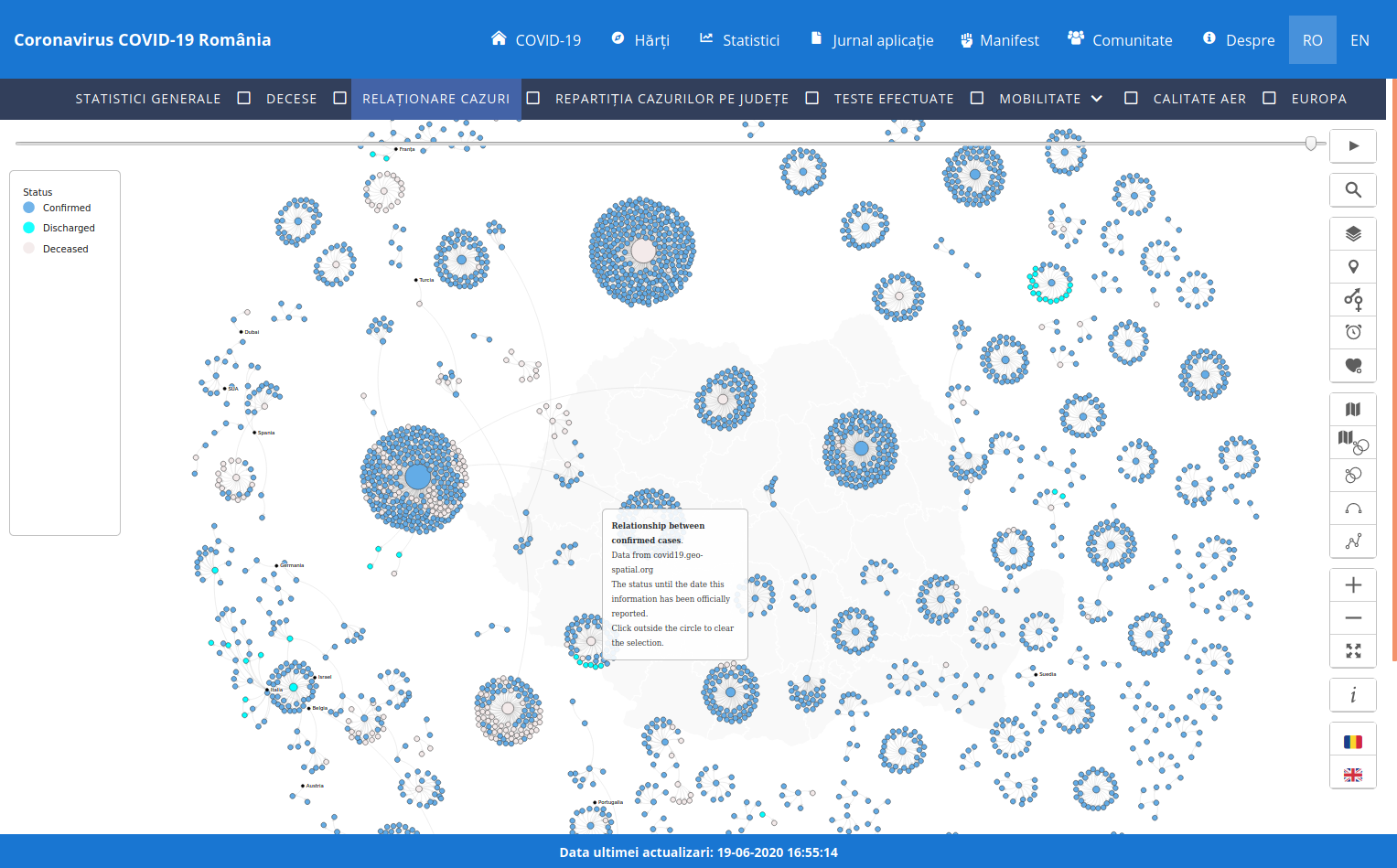
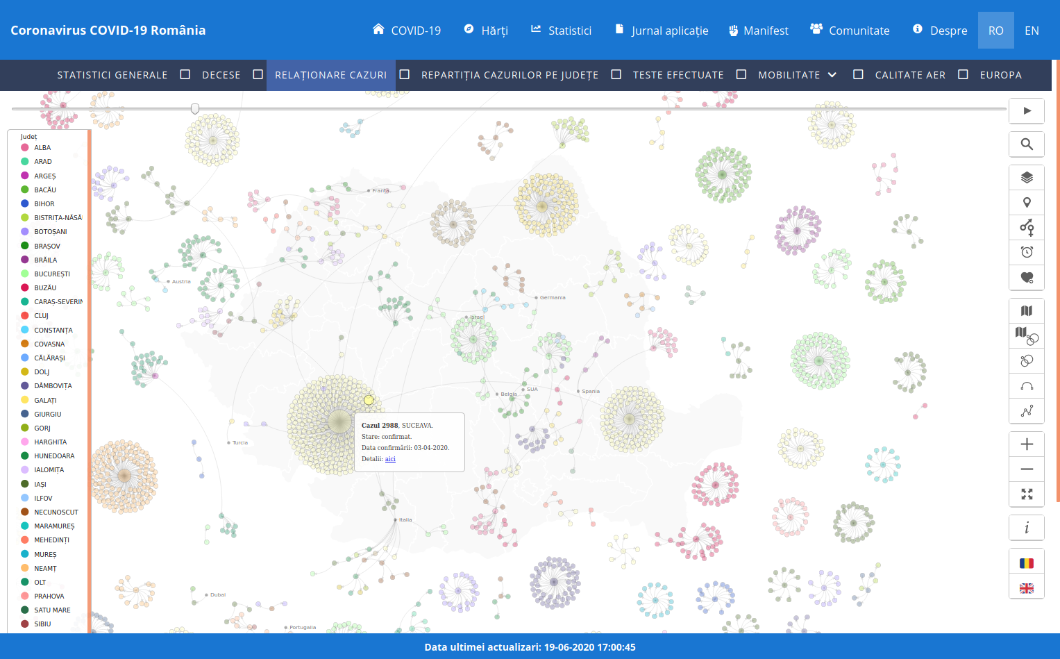
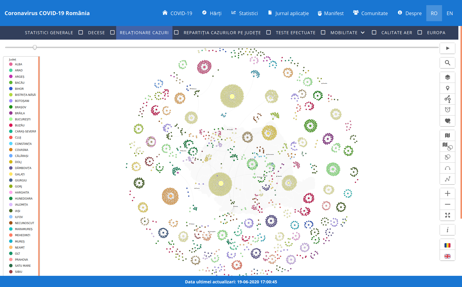
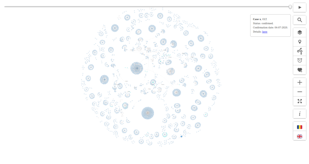
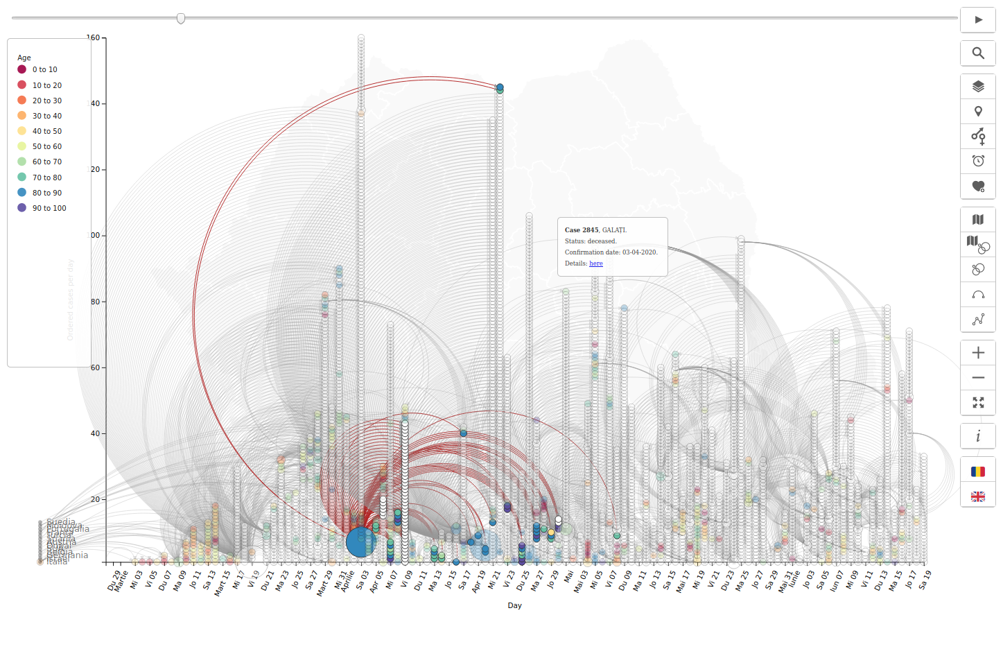
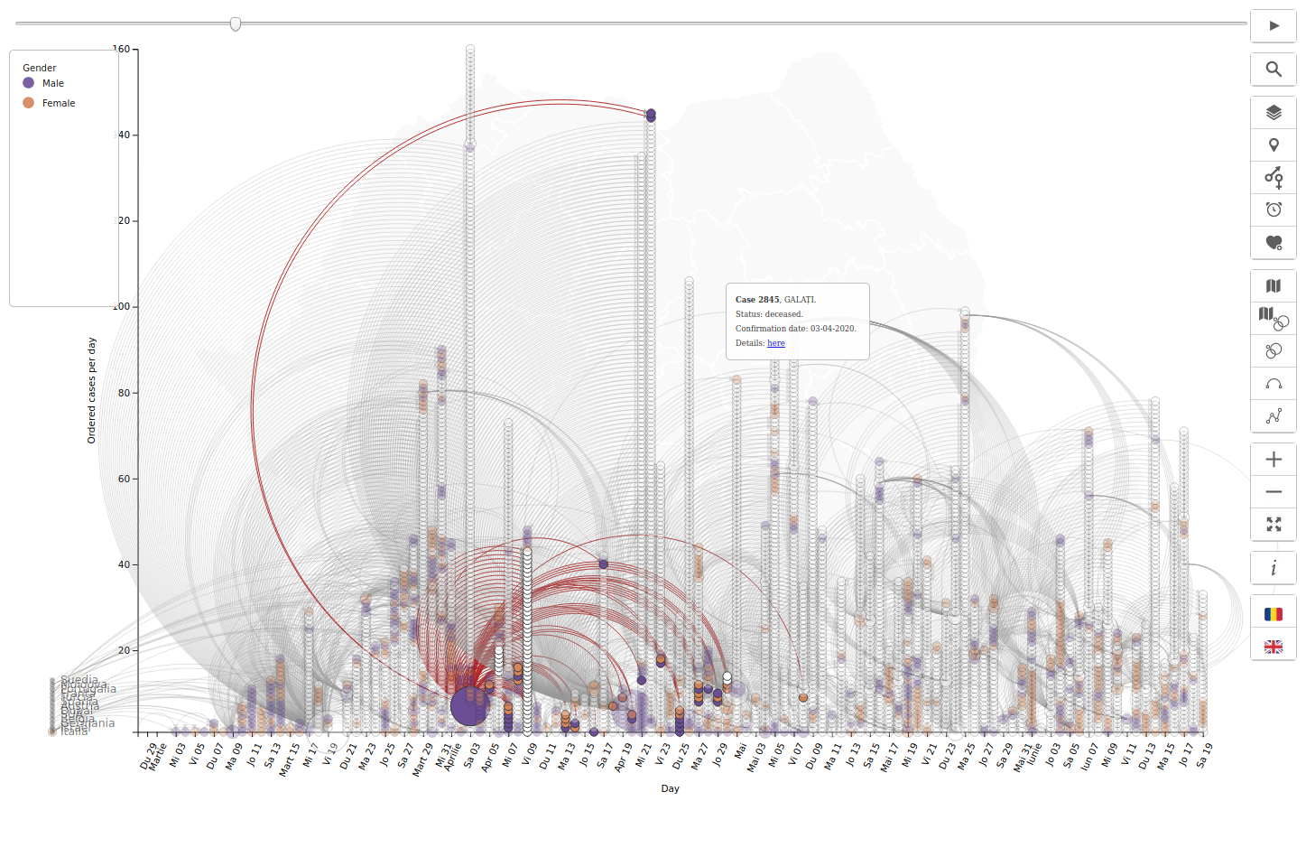
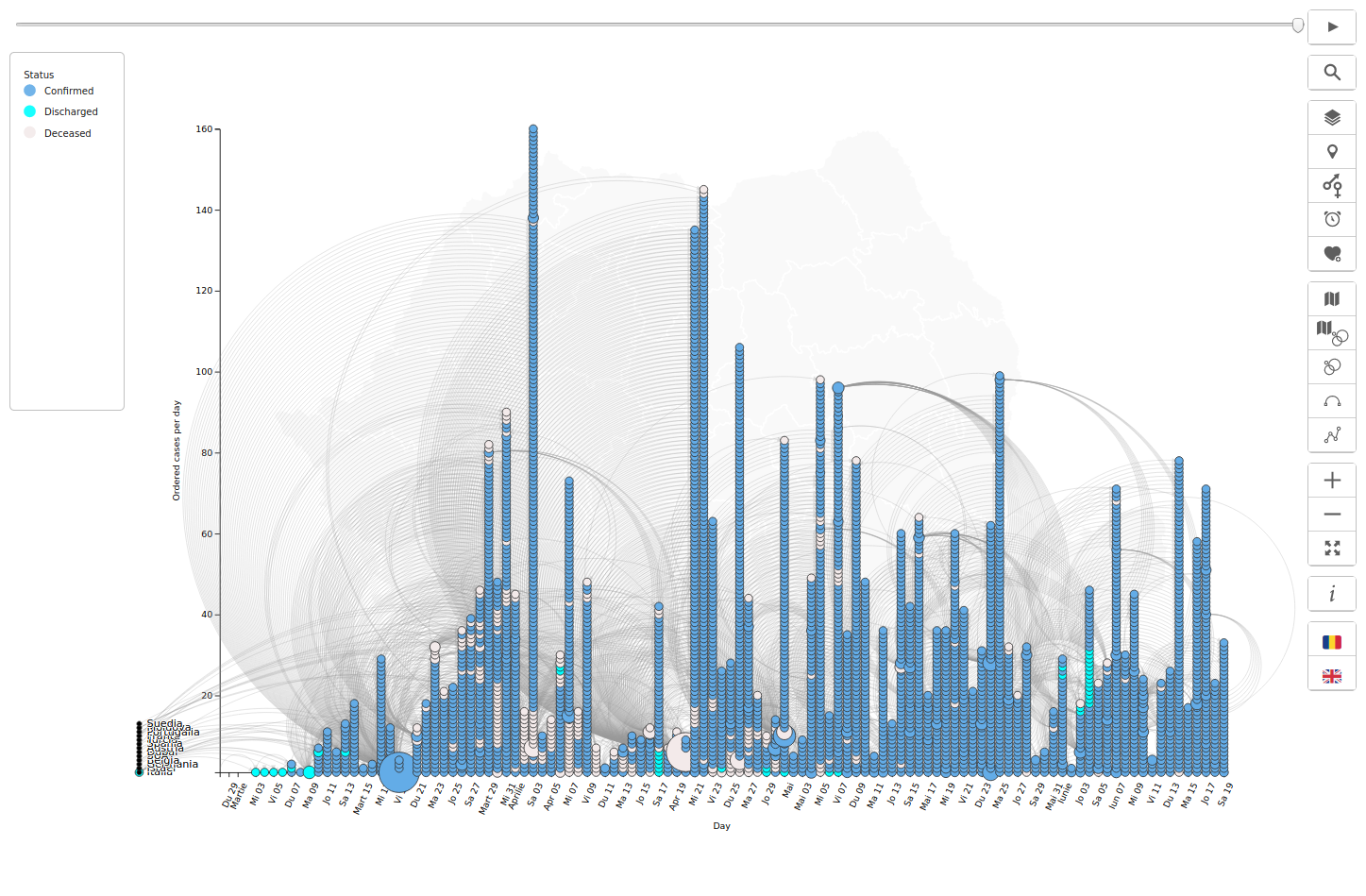
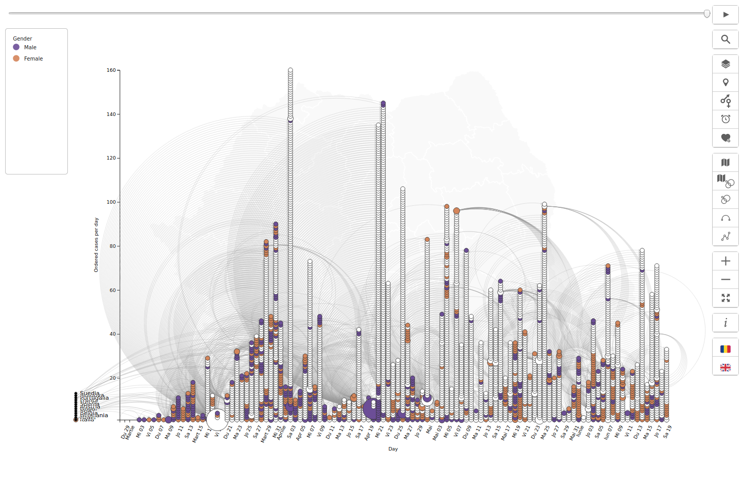
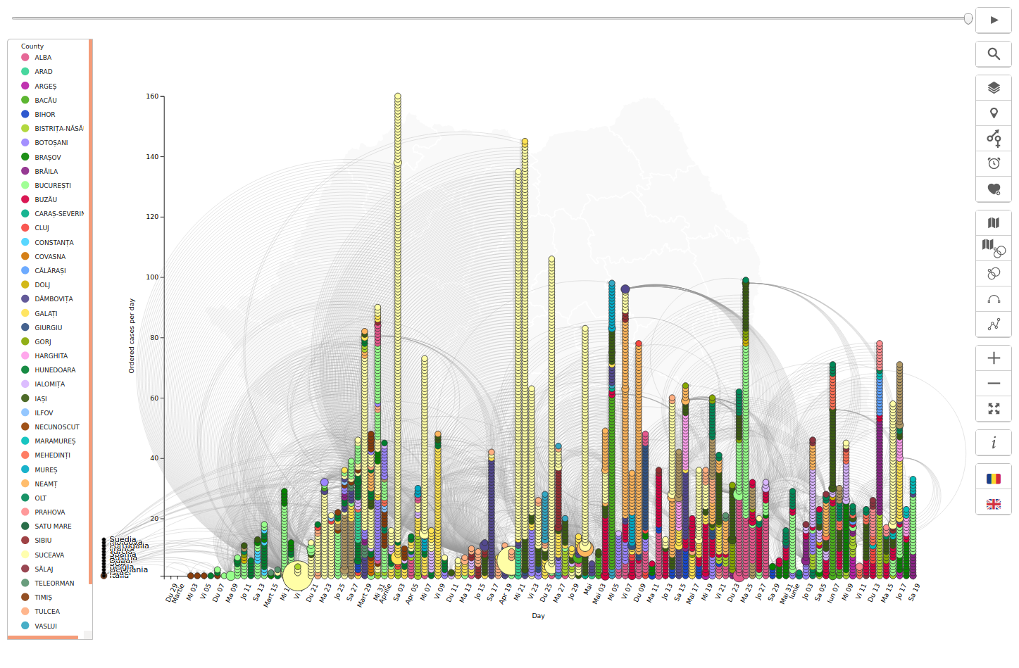
See how many people got infected by each person. In the visualization below, each circle represents a person, its size is proportional to how many people has infected (= were found in the area where the virus was spread by an infected person) and the color represents either status (confirmed, discharged from the hospital, deceased), county, gender or age.
See how the infected people relate to each other. When a person was infected and the source was known, that was considered a connection, and was represented as a curved line.
See where outbreaks could occur. The clusters of people, created based on the connections, could reveal possible hot spots and could help us discover the locations and the circumstances that can lead to outbreaks.
Explore. Hover over each person to see how many people got in contact with, more details, and the link to the original media article. Select another theme to color all people by county, gender, location or status. Zoom in to reveal labels, and pan to navigate. Switch the language (Romanian or English) as desired.

Data source: https://covid19.geo-spatial.org/api/statistics/getCaseRelations
Code: https://github.com/alexaac/covid-19-ro-cases-relations
Live: https://maptheclouds.com/covid-19-ro/cases-relations/en/ / https://covid19.geo-spatial.org/statistici/relationare-cazuri?chart=covid-19-ro-cases-relations
Type: network diagram
Initial project: https://github.com/alexaac/covid-19-ro-cases-relations-all
The last data update: 30th of July 2020.
Why did I make this graphic?
I wanted to see how were the confirmed cases related, how did the virus spread from the first cases from the foreign countries, to the transmission inside the community. This kind of visualization would highlight the clusters of cases that could lead to outbreaks, and would require more attention from the officials.
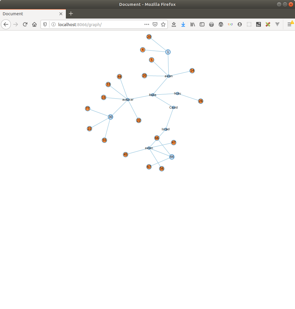
In March, I have seen an article on Kontinentalist on how cases were related in Singapore, so I offered to create a similar graphic, for Romania. I made a new Github repository, created an initial graph, checked in the free code and exposed it through gh-pages.
The best way to show the relations between people was a Network Diagram, or a force layout in D3.js world.
Force-directed graph drawing algorithms are a class of algorithms for drawing graphs in an aesthetically-pleasing way. Their purpose is to position the nodes of a graph in two-dimensional or three-dimensional space so that all the edges are of more or less equal length and there are as few crossing edges as possible, by assigning forces among the set of edges and the set of nodes, based on their relative positions, and then using these forces either to simulate the motion of the edges and nodes or to minimize their energy. (src)
A Network Diagram, also known as Network Graph, Network Map, Node-Link Diagram […] shows how things are interconnected through the use of nodes / vertices and link lines to represent their connections and help illuminate the type of relationships between a group of entities. Typically, nodes are drawn as little dots or circles, but icons can also be used. Links are usually displayed as simple lines connected between the nodes. However, in some Network Diagrams, not all of the nodes and links are created equally: additional variables can be visualized, for example, by making the node size or link stroke weight proportion to an assigned value. (src)
Implementation details
I’ve set the D3.js forces simulation so that nodes would be displayed around a center of gravity, the cases would be drawn as points, the links between them as lines, and attraction-rejection force algorithms would automatically distribute all the elements in the drawing space (or canvas).
I had to find a workaround to add the source countries to the simulation, and at some point we decided to leave out the nodes that were not linked to other community cases.

test 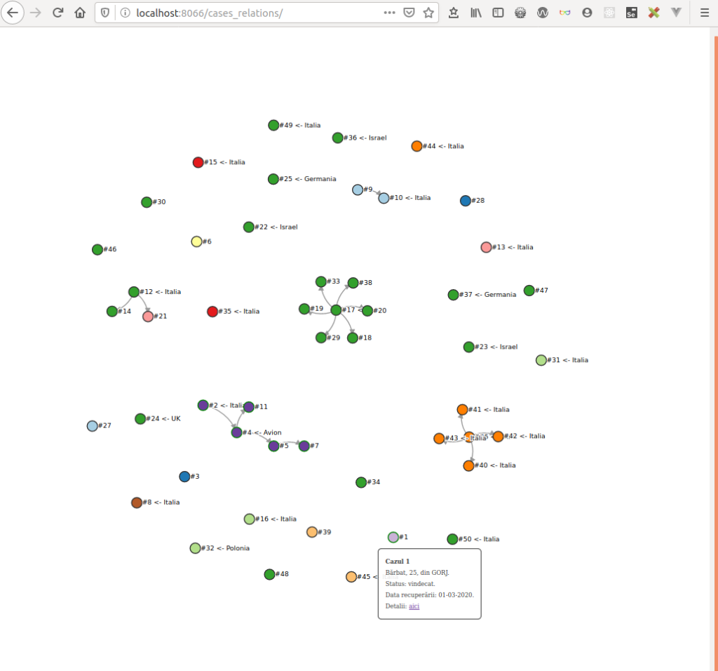
first case 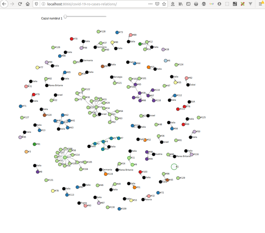
evolution 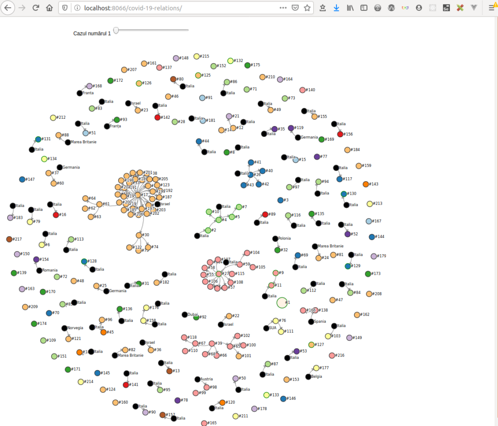
group by source case 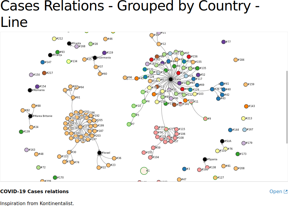
group by county 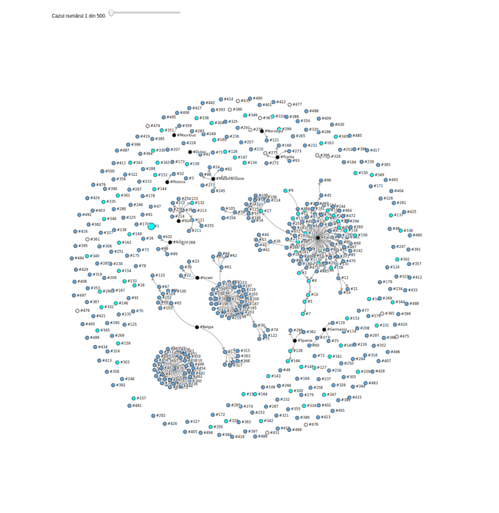
limit to 500 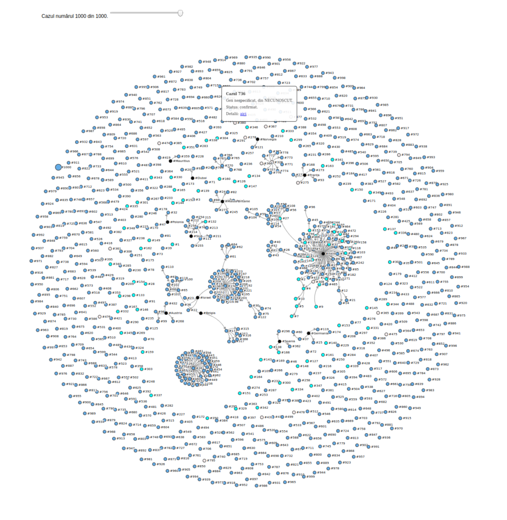
limit to 1000 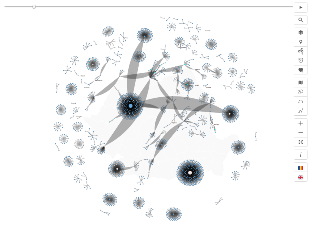
bugs 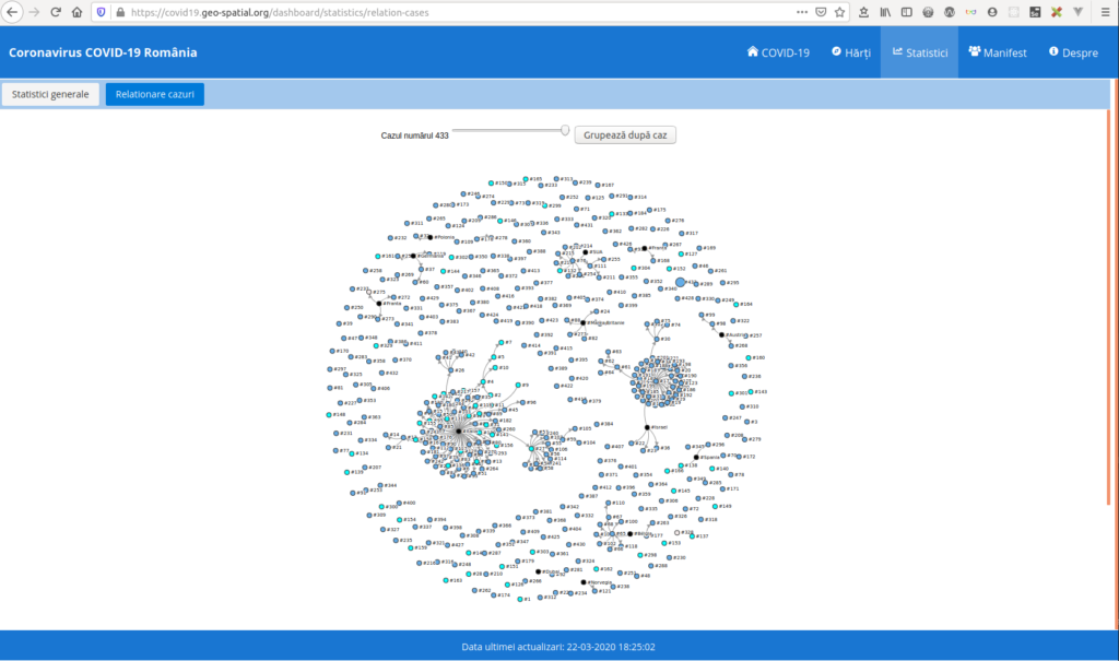
on covid19.geo-spatial 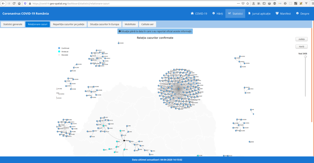
keep cases with links 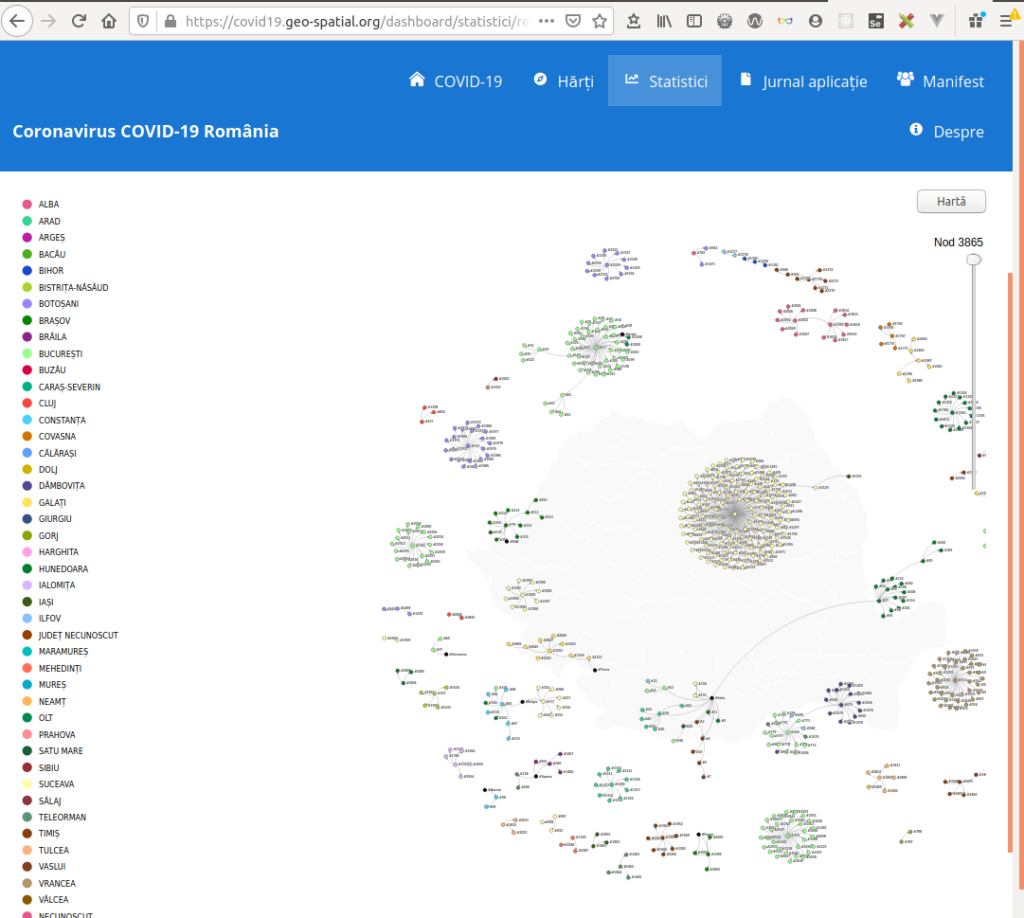
color by county
Then, I wrapped the code in a JavaScript framework, svelte, and I’ve added different features to the app, that I thought would be useful: display on the map, cluster the cases per county, display the cases on a timeline graph, ordered by day and stacked. Layouts by screen resolution, legends, navigation – zoom and pan, a play button that would step through each case, pop-up info about the case, web link to the source article, display the labels by zoom. Coloring by county, gender, age, status.
opacity 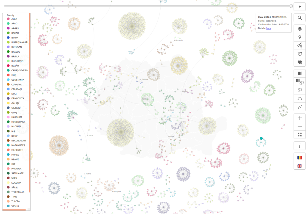
color by county 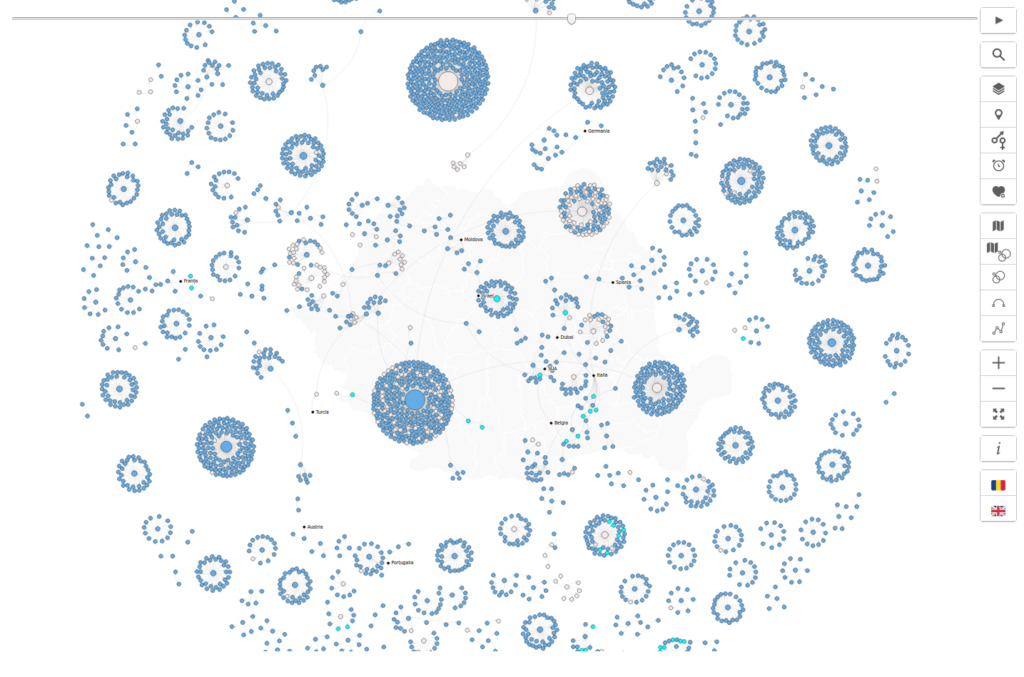
0 opacity 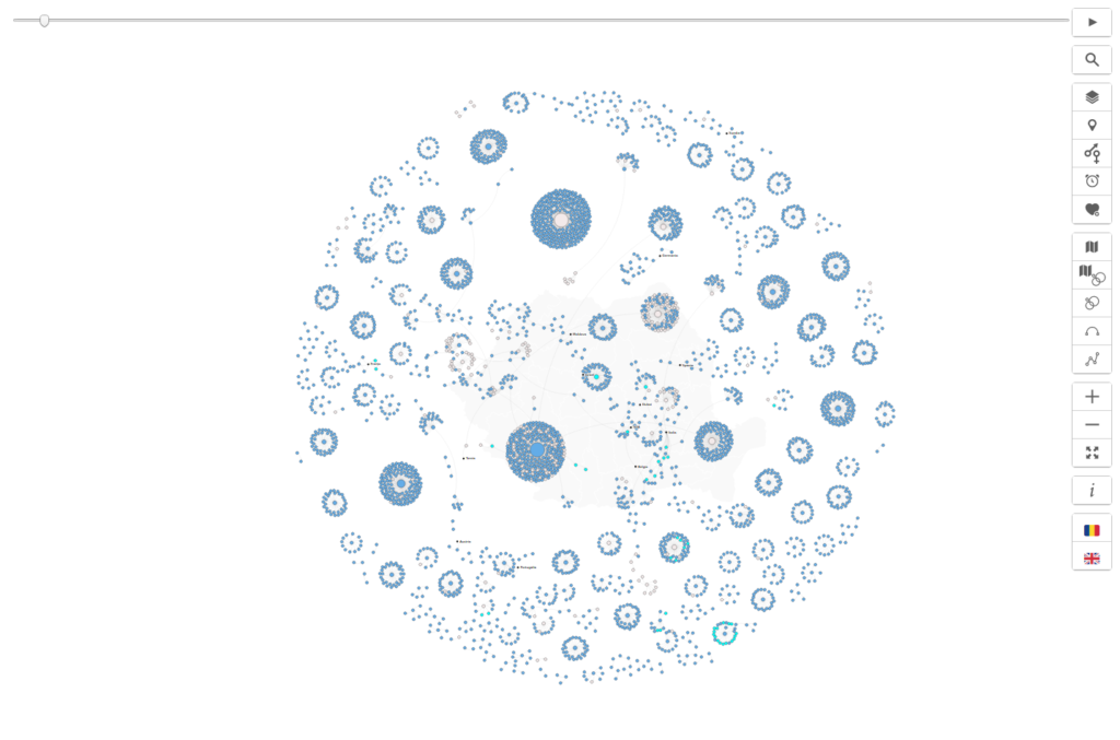
full zoom 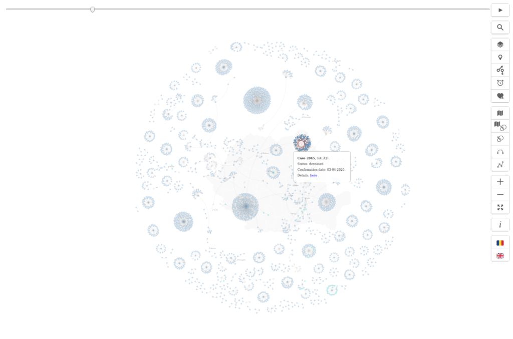
hover 
status close-up 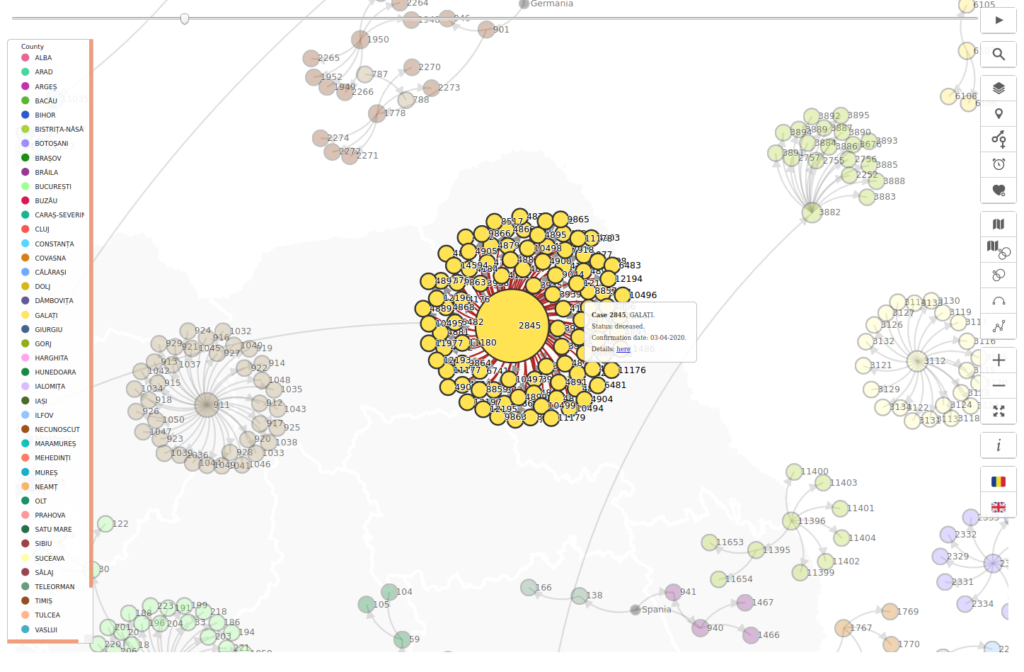
county close-up 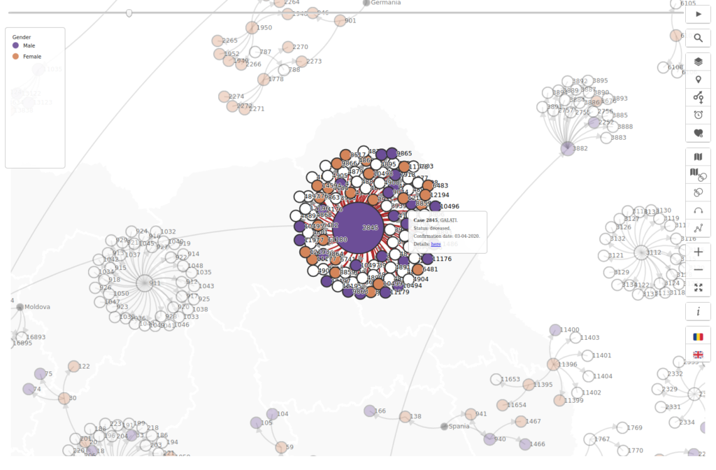
gender close-up 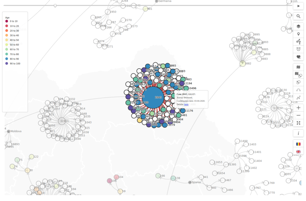
age close-up 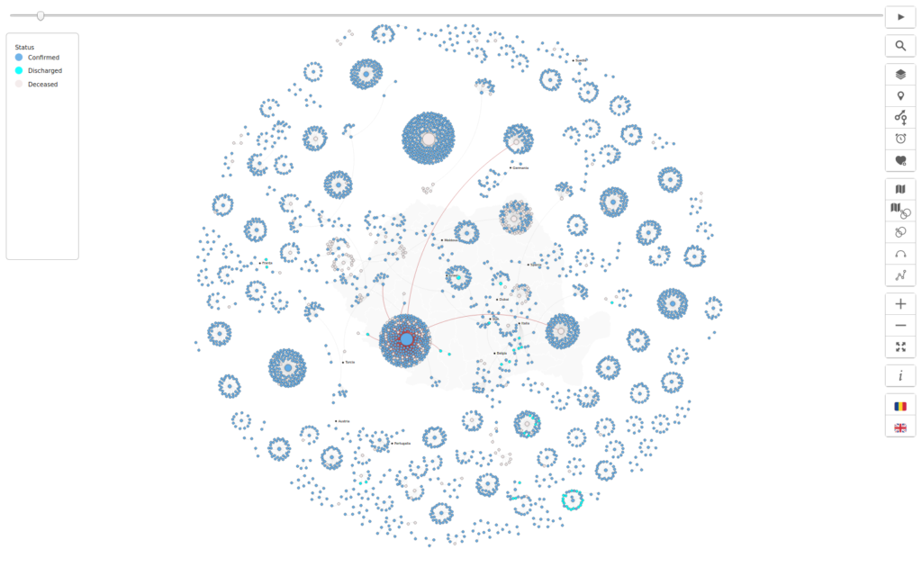
highlight
initial zoom 
full zoom 
opacity 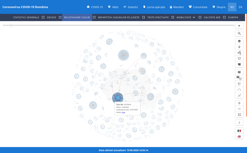
hover 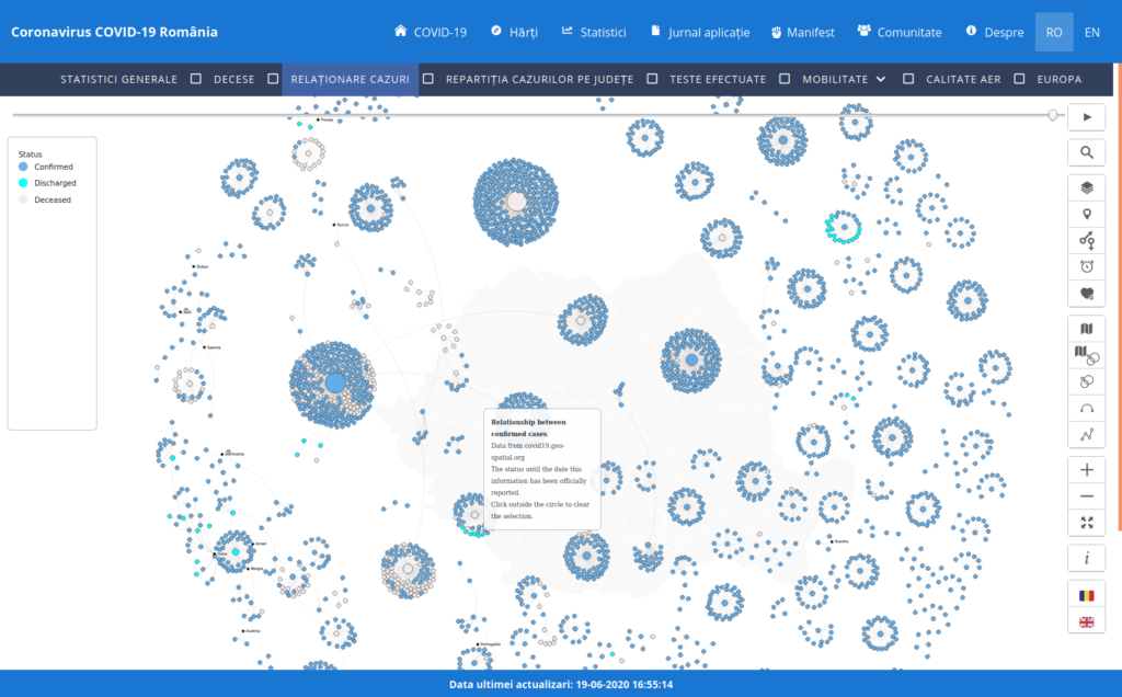
legend – by status 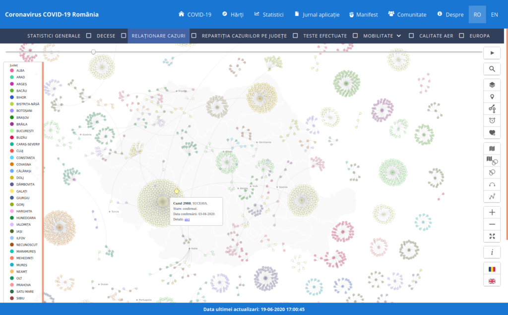
legend – by county 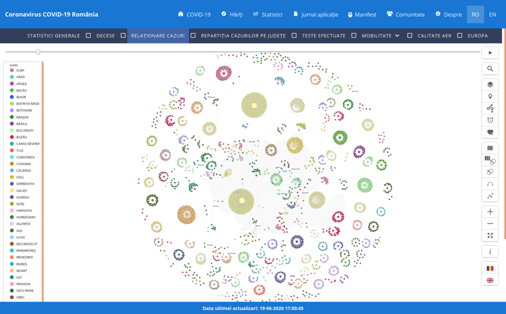
color by county 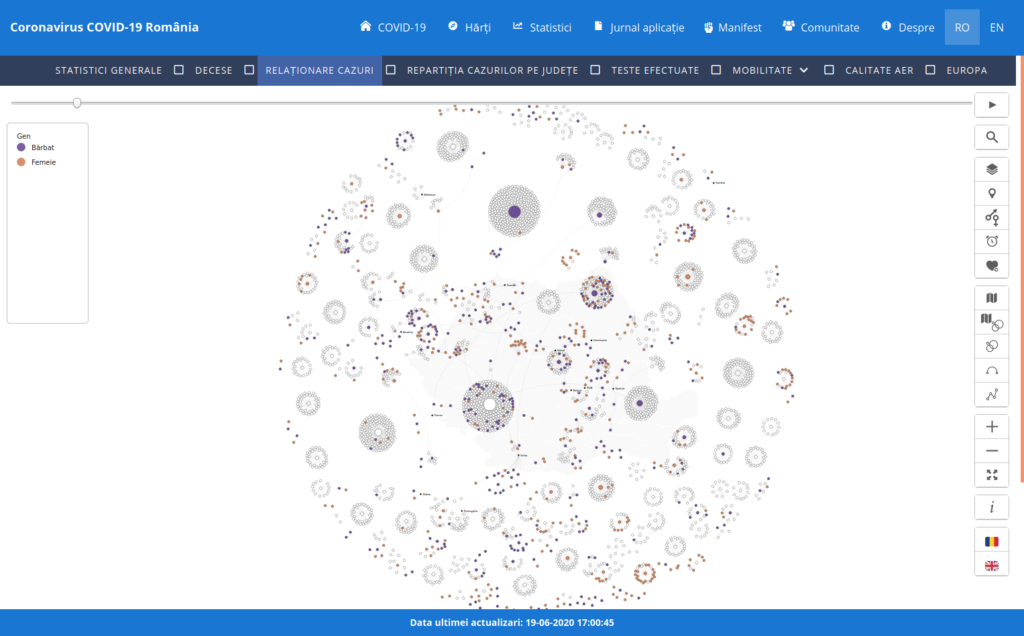
color by gender 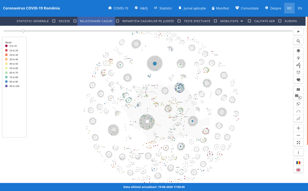
color by age 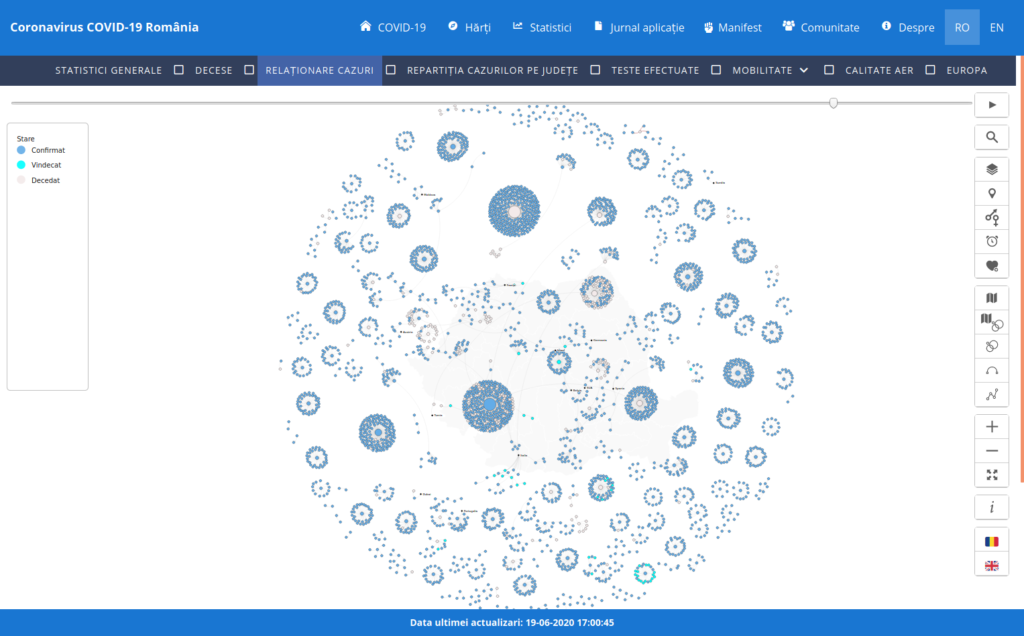
color by status


Challenges
As the number of cases increased, I had to think about performance issues. I realized D3.js didn’t intend the ‘force layout’ to be used for thousand and thousand of nodes, because that would have been a big load on the DOM (Document Object Model). I also realized that it is not good practice to display so much info at once, and it would be better to aggregate it at a lower zoom.
However, I still wanted to see the general pattern and display all nodes, so I tried to increase performance removing the svelte wrapper, and separate the application by chart type.
status 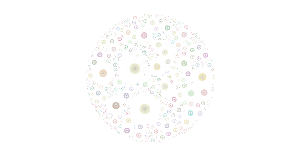
counties
I also tried to use HTML Canvas to draw the links, and a web-worker to pre-calculate the simulation values, but I didn’t see a significant increase in performance.
A method that worked was to run a script in the back-end using Node.js to both pre-calculate the simulation values and generate the SVG code for the diagram. Then I have injected the SVG in the JavaScript file, bound the data on the SVG again and made the D3.js selections work. A better approach would be to migrate to a Node.js application, and test the Node.js streams (data-handling methods used to read or write input into output sequentially).
Another method would be to use WebGL to generate the diagram, because it is very good at rendering loads of elements on the canvas, then find a way to highlight the JavaScript interactions.
Further work
- Unit tests
- WebGL to improve performance
- Move duplicate code into a shared library
- Show a sortable table for related cases, zoom at node on focus
- Migrate to Node.js app and use streams
- Make a dashboard with all the graphics
- Create a scroll-driven story with all the graphics
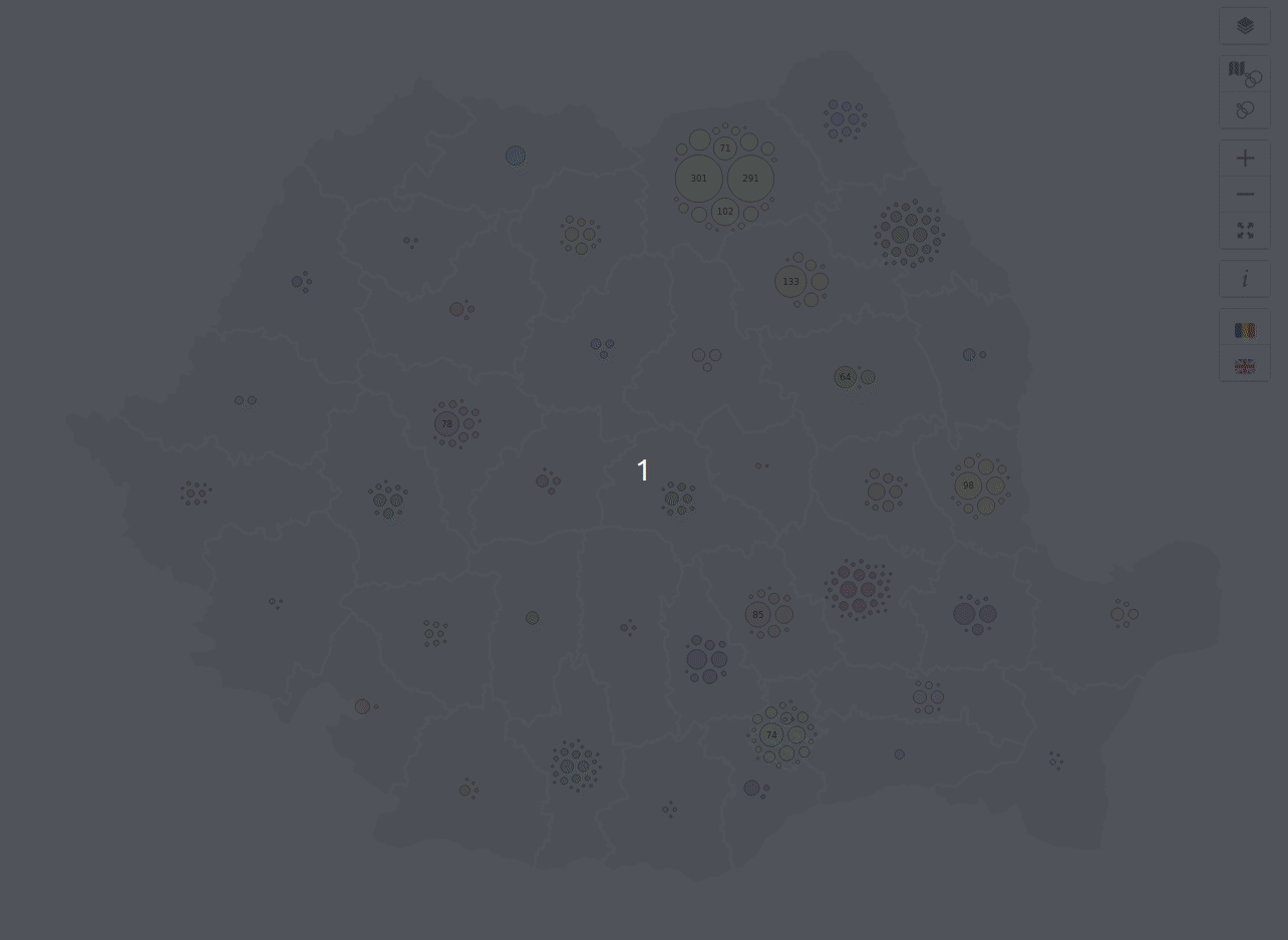
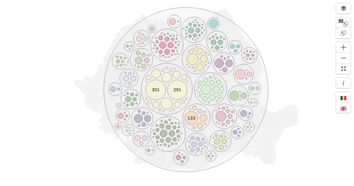
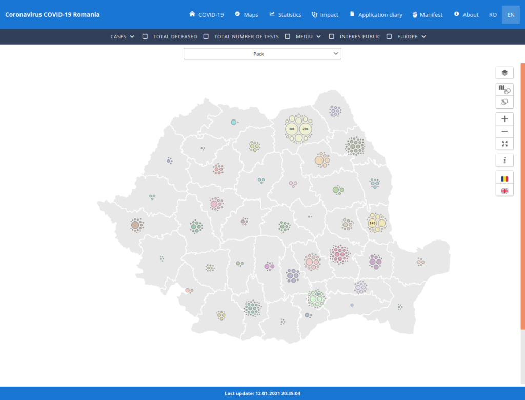
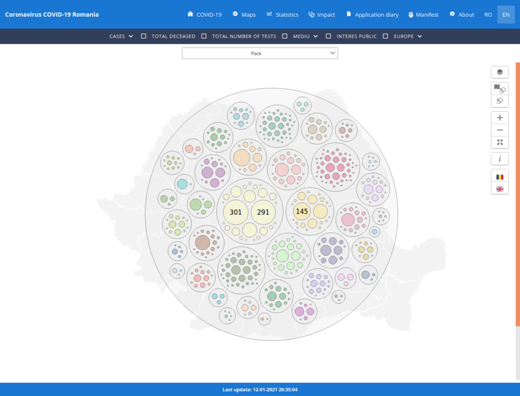
COVID-19 in România – Possible Outbreaks per County
Data source: https://covid19.geo-spatial.org/api/statistics/getCaseRelations
Geometries: http://geoportal.ancpi.ro/portal/apps/webappviewer/index.html?id=faeba2d173374445b1f13512bd477bb2
Code: https://github.com/alexaac/covid-19-ro-cases-pack
Live: https://maptheclouds.com/covid-19-ro/cases-pack/en/ / https://covid19.geo-spatial.org/statistici/relationare-cazuri?chart=covid-19-ro-cases-pack
Type: map + circle pack
Why did I make this graphic?
I wanted to see how the clusters of cases were distributed on the map, and, in order to improve visibility, I have aggregated the points by their source case. In fact, there are two visualizations, one representing the clusters on map, and another representing a big pack of all the counties.
Implementation details
I have converted the counties geometries file to GeoJSON using GDAL ‘Convert Format’ (in QGIS), then I have used Mapshaper to simplify the GeoJSON files, and bundle all the data into a single TopoJSON file. This format reduces the file size and has some other useful features, like topology-preserving shape simplification.
TopoJSON is an extension of GeoJSON that encodes topology. Rather than representing geometries discretely, geometries in TopoJSON files are stitched together from shared line segments called arcs. (src)
Then, the points representing the aggregated data were placed in a circular manner over each county, using a pack layout.
Circle Packing, also known as a Circular Treemap, is a variation of a Treemap that uses circles instead of rectangles. Containment within each circle represents a level in the hierarchy: each branch of the tree is represented as a circle and its sub-branches are represented as circles inside of it. The area of each circle can also be used to represent an additional arbitrary value, such as quantity or file size. Colour may also be used to assign categories or to represent another variable via different shades. (src)
cases on the map 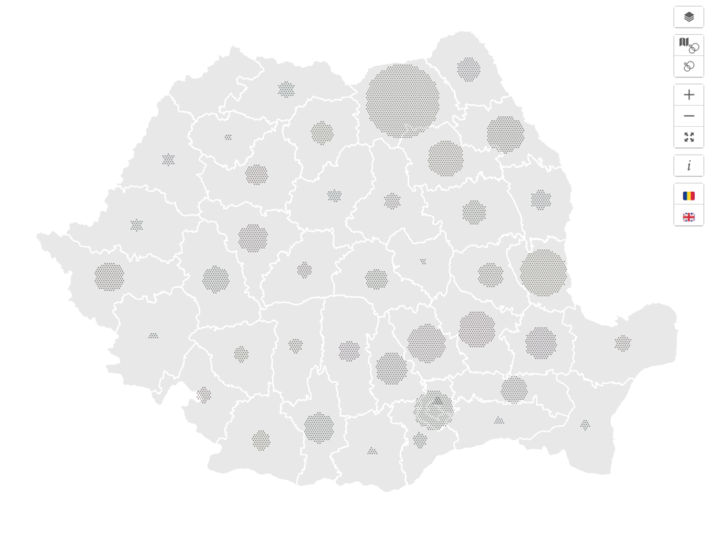
cases on the map – dispersed 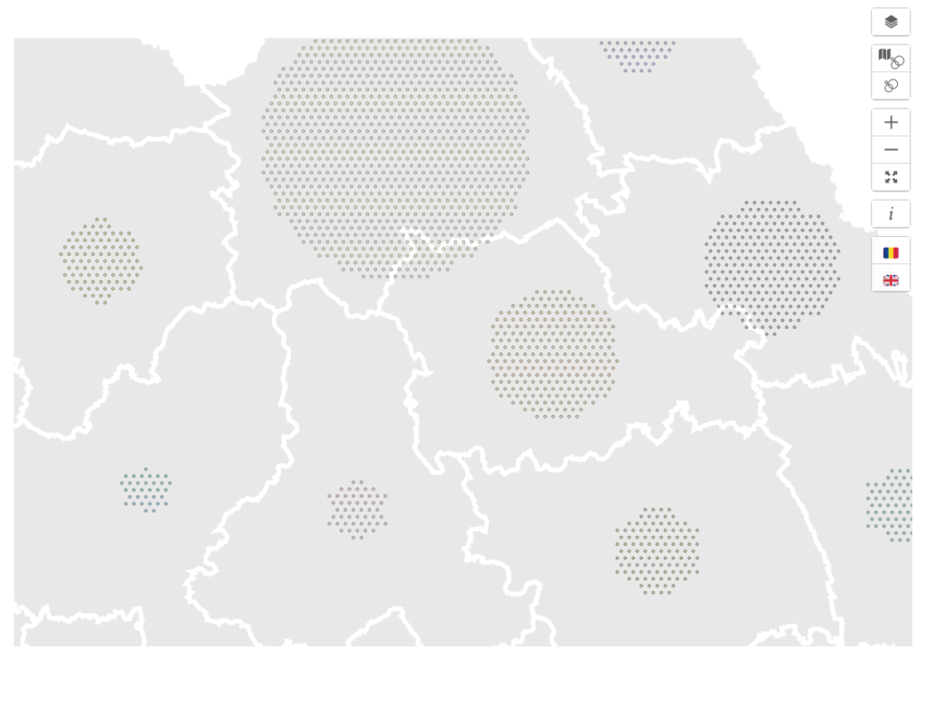
cases on the map – dispersed 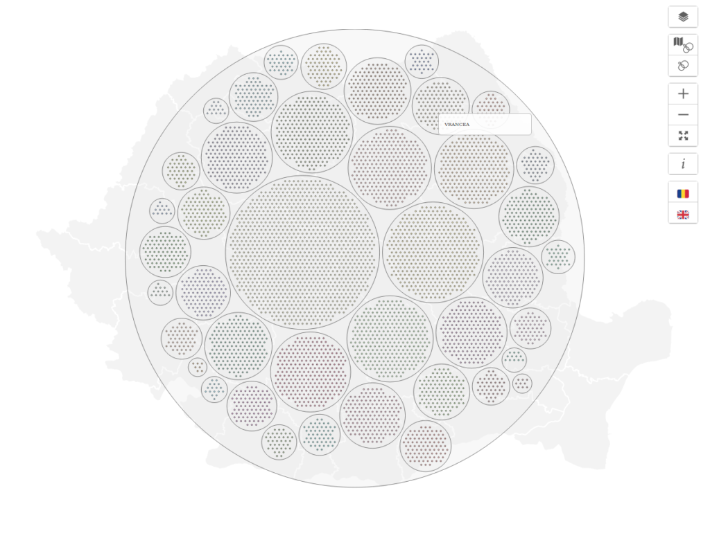
grouped by county – pack 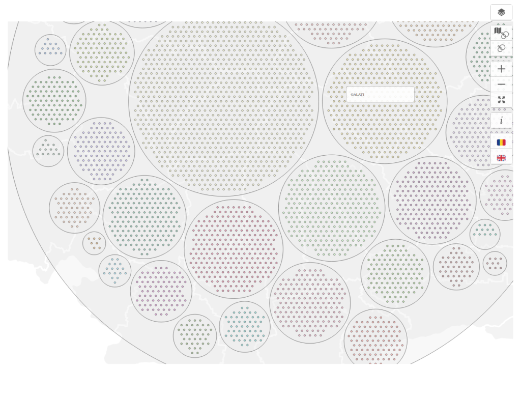
grouped by county – pack 
grouped by county and aggregated by source case – pack 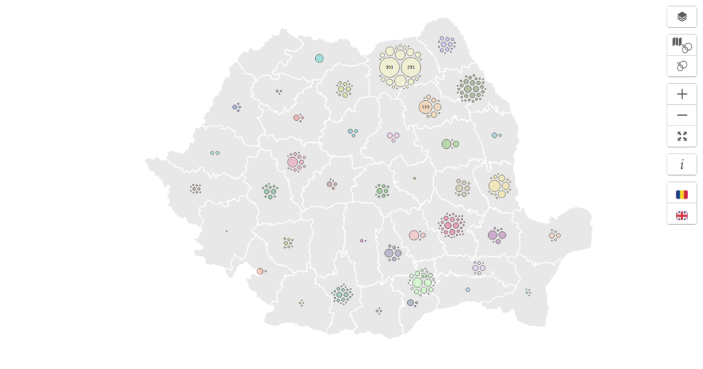
grouped by county and aggregated by source case – map

Further work
- Unit tests
- Move duplicate code into a shared library
- Animate a force layout above each county
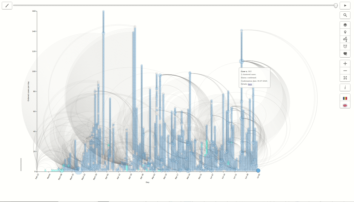
COVID-19 in România – Relationship between cases in time
Data source: https://covid19.geo-spatial.org/api/statistics/getCaseRelations
Code: https://github.com/alexaac/covid-19-ro-cases-timeline/
Live: https://maptheclouds.com/covid-19-ro/cases-timeline/en/ / https://covid19.geo-spatial.org/statistici/relationare-cazuri?chart=covid-19-ro-cases-timeline
Type: arc diagram + bubble chart
Why did I make this graphic?
I thought it would be easier to see how much time it has taken for the next related case to be confirmed, from the emergence of a source case, and how were the cases related over time.
Implementation details
I could have used a force layout, and distribute the points using a forceX attribute, but for performance I have used directly the day attribute to plot the points on the X axis, and a calculated order by day attribute, for the Y axis, and the number of related cases for the circle diameter, and the result was a bubble chart.
A Bubble Chart is a multi-variable graph that is a cross between a Scatterplot and a Proportional Area Chart. Like a Scatterplot, Bubble Charts use a Cartesian coordinate system to plot points along a grid where the X and Y axis are separate variables. However. unlike a Scatterplot, each point is assigned a label or category (either displayed alongside or on a legend). Each plotted point then represents a third variable by the area of its circle. Colours can also be used to distinguish between categories or used to represent an additional data variable. Time can be shown either by having it as a variable on one of the axis or by animating the data variables changing over time. (src)
I have also used the arc diagram layout for the links.
Arc Diagrams are an alternate way of representing two- dimensional Network Diagrams. In Arc Diagrams, nodes are placed along a single line (a one-dimensional axis) and arcs are used to show connections between those nodes. (src)
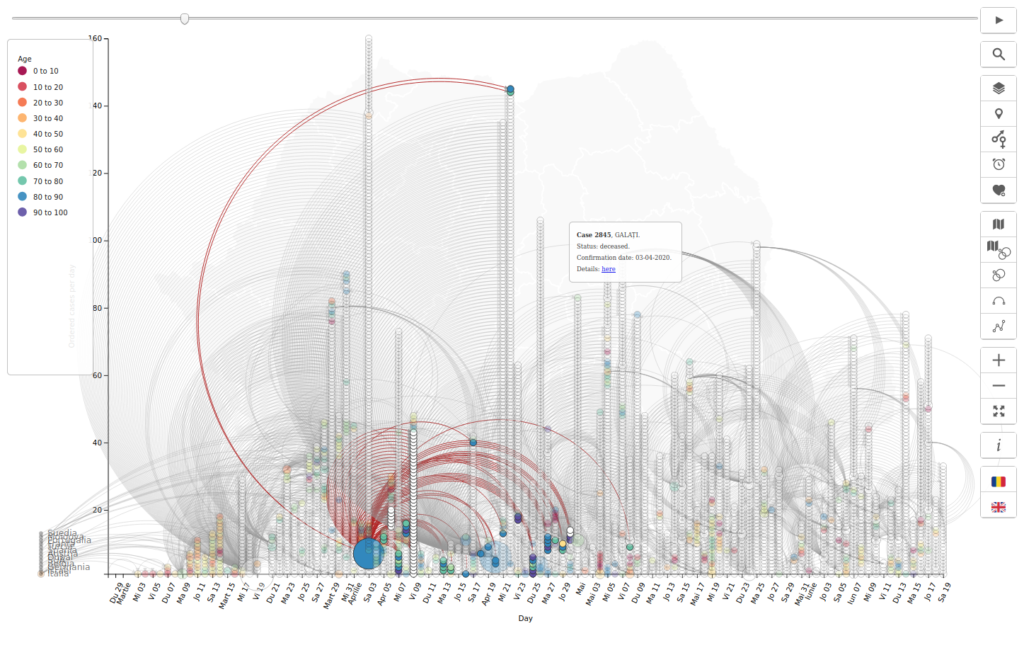
age – hover 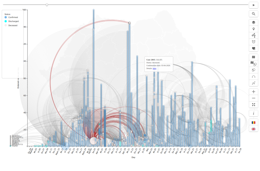
status – hover 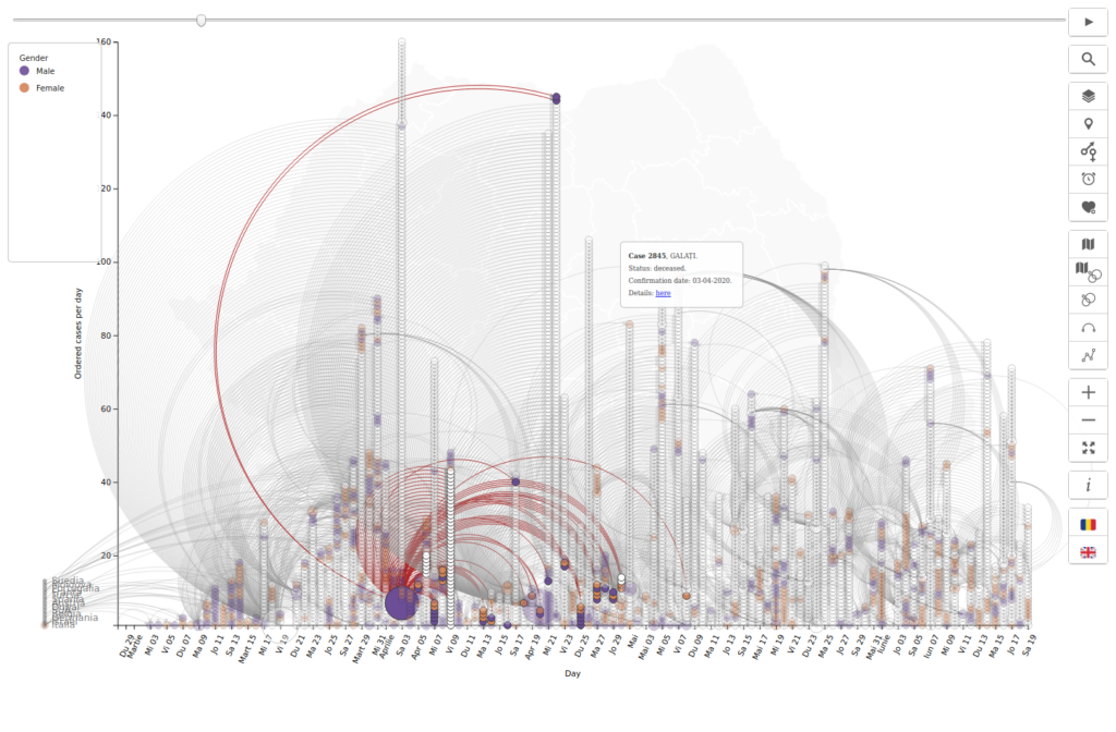
gender – hover 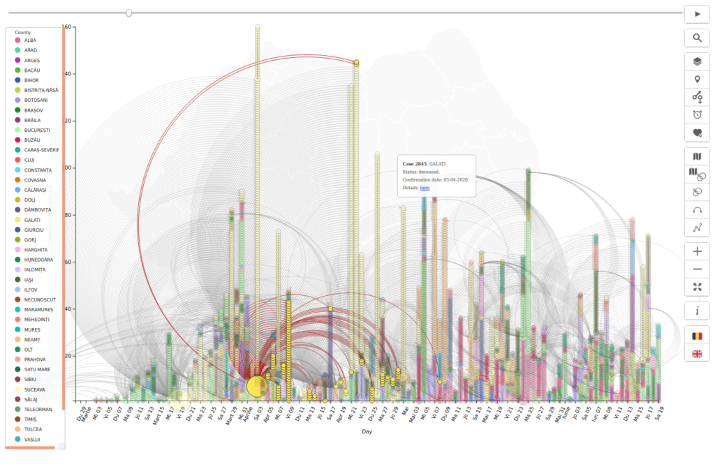
counties – hover 
status 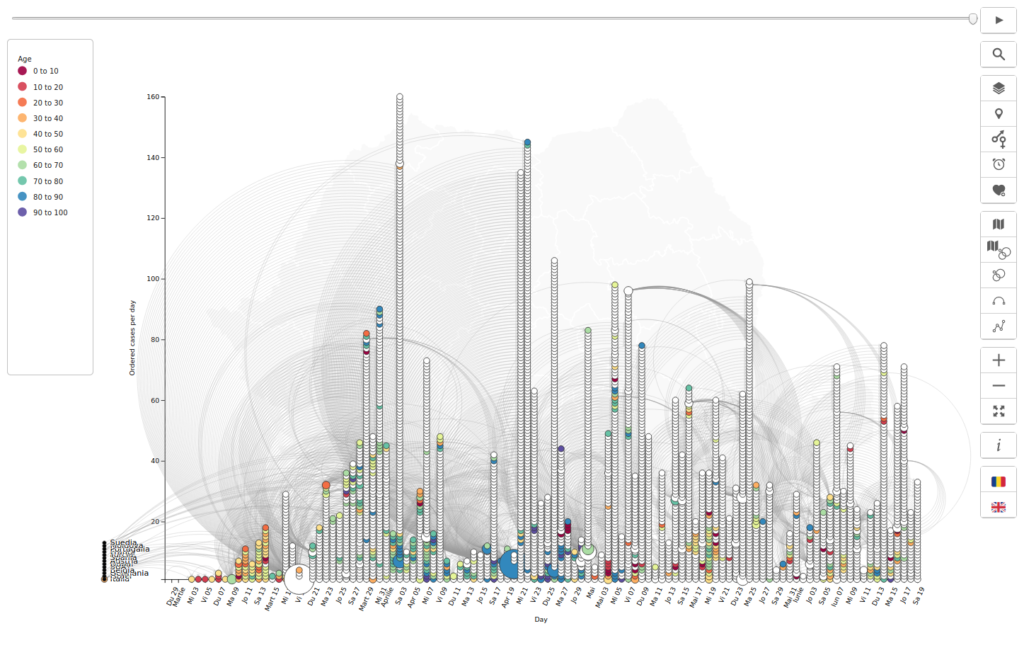
age 
gender 
counties


then 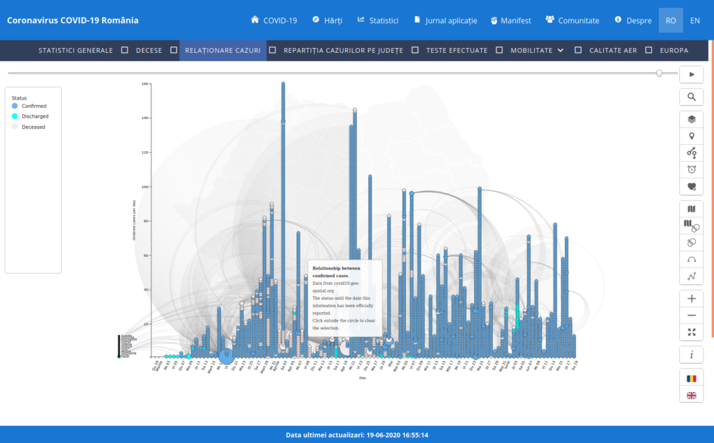
then 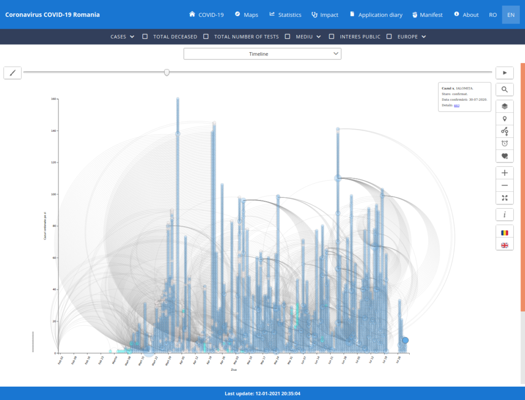
now 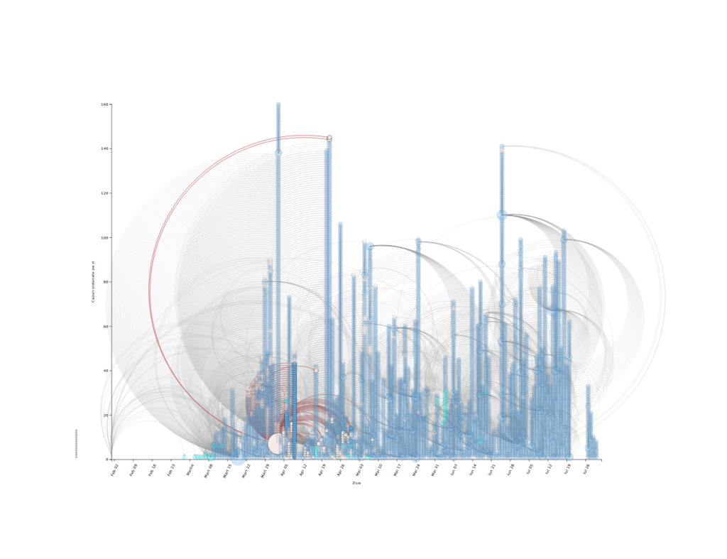
now

Further work
- Unit tests
- Move duplicate code into a shared library
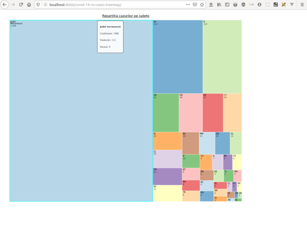
COVID-19 în România – Cases by county
Data source: https://covid19.geo-spatial.org/api/dashboard/v2/getCasesByCounty
Code: https://github.com/alexaac/covid-19-ro-cases-treemap
Live: https://maptheclouds.com/covid-19-ro/cases-treemap/ / https://covid19.geo-spatial.org/statistici/repartitie-cazuri-judete
Type: treemap
Why did I make this graphic?
I wanted to highlight the counties with the biggest number of confirmed cases, so I have plotted the counties ordered by case numbers.
Implementation details
I used a treemap, that recursively subdivides area into rectangles, and assigned an unique color to each county.
Treemaps are an alternative way of visualizing the hierarchical structure of a Tree Diagram while also displaying quantities for each category via area size. Each category is assigned a rectangle area with their subcategory rectangles nested inside of it. When a quantity is assigned to a category, its area size is displayed in proportion to that quantity and to the other quantities within the same parent category in a part-to-whole relationship. Also, the area size of the parent category is the total of its subcategories. If no quantity is assigned to a subcategory, then it’s area is divided equally amongst the other subcategories within its parent category. (src)
Then, I have chosen a color palette generated on iwanthue, using the following settings:
// https://medialab.github.io/iwanthue/
// hcl[0]>=0 && hcl[0]<=340
//     && hcl[1]>=30 && hcl[1]<=80
//     && hcl[2]>=35 && hcl[2]<=100
Further work
- Unit tests
- Different color schemas
test 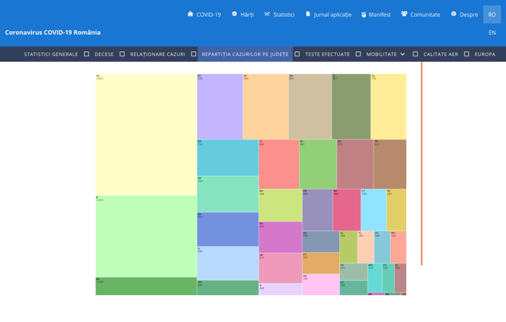
app earlier 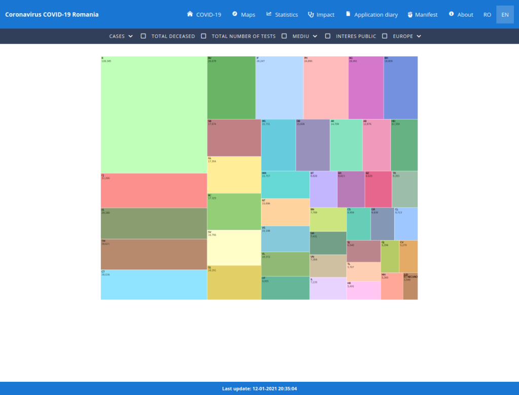
app now 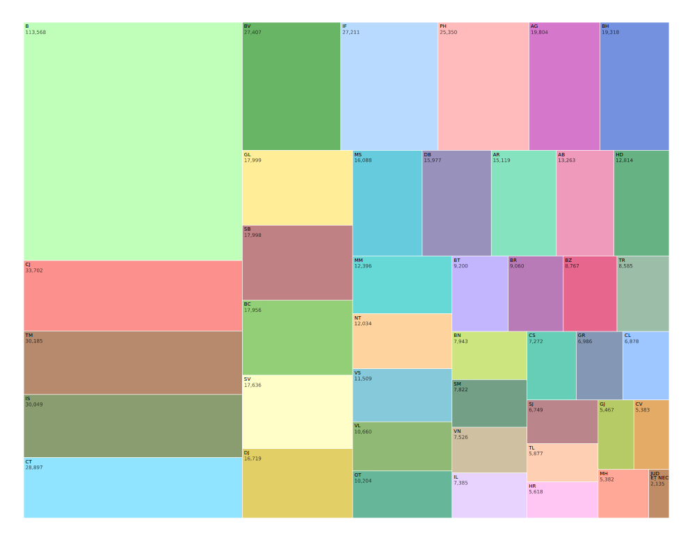
app now
COVID-19 in România – Relationship between cases, per county
Data source: https://covid19.geo-spatial.org/api/statistics/getCaseRelations
Code: https://github.com/alexaac/covid-19-ro-cases-counties
Live: https://maptheclouds.com/covid-19-ro/cases-counties/en/
Type: network diagram
This is a variant of the ‘Relationship between cases’ graphic, in which the cases are grouped by county and source case.
hover 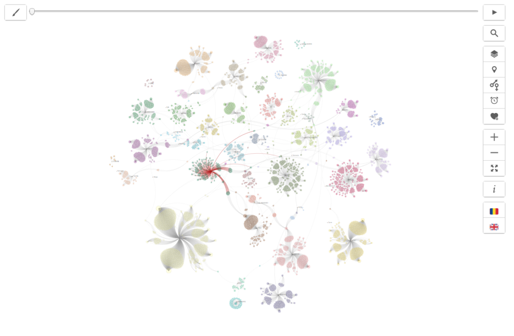
hover 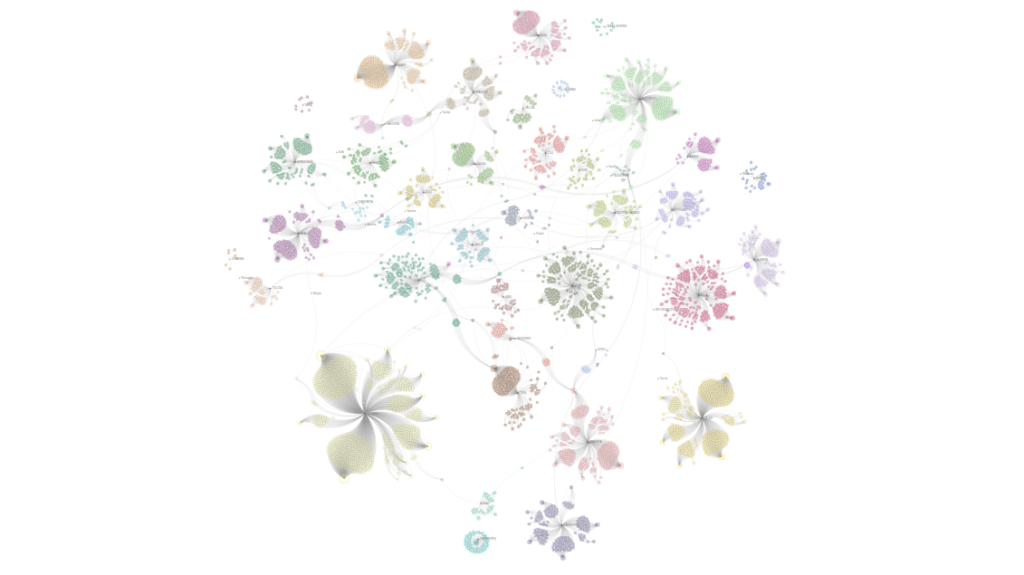
counties 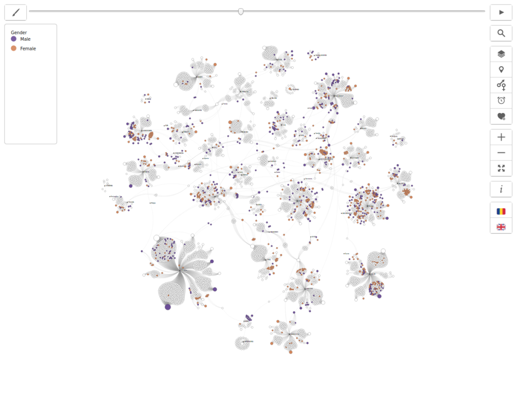
gender 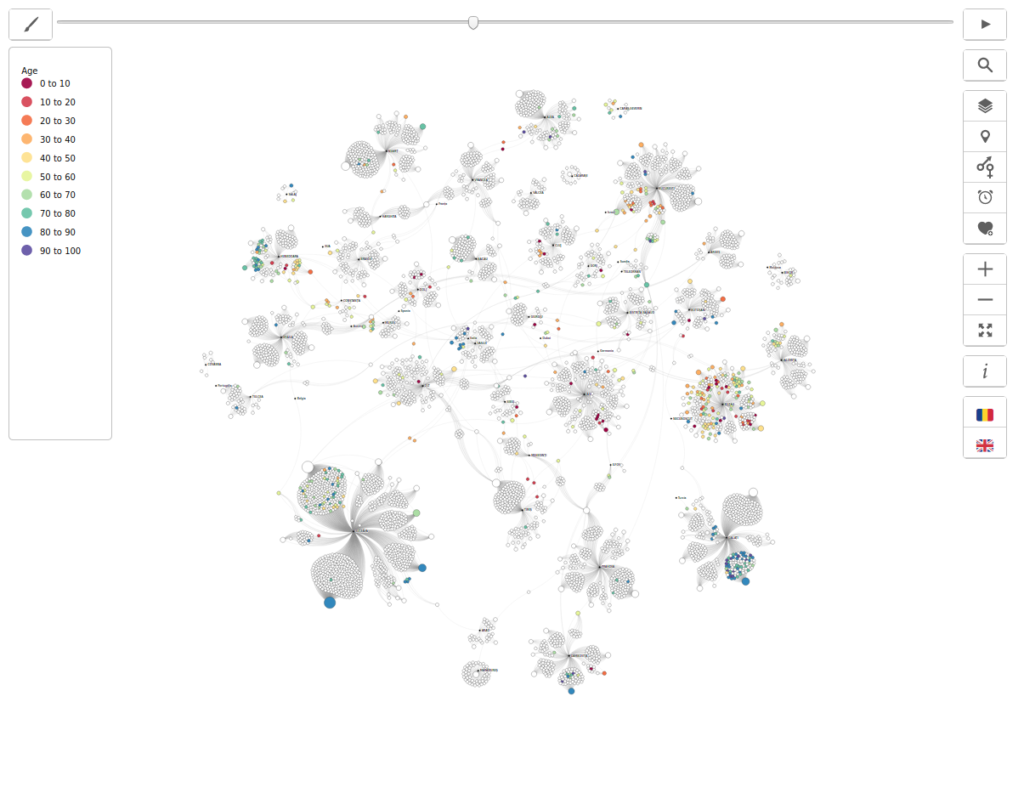
age 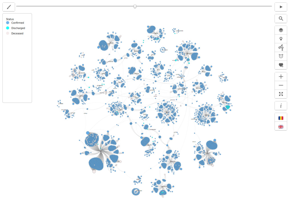
status 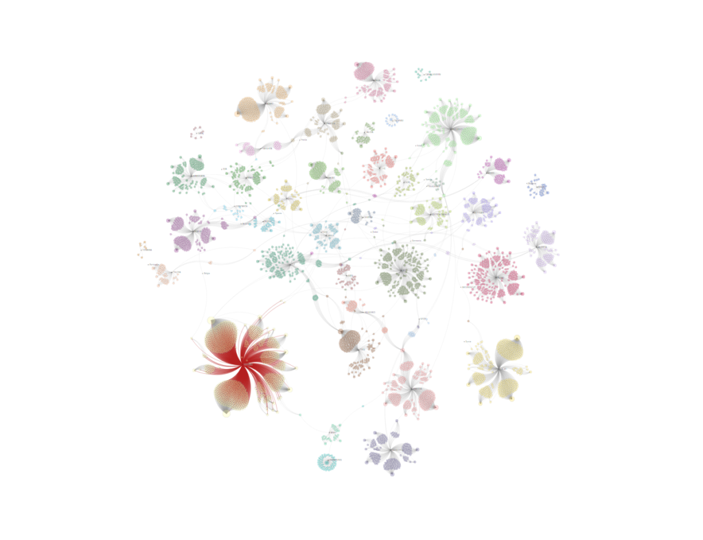

That was it. Thanks again, covid19.geo-spatial.org, for your initiative. 🤗