Hello, again. It’s been a while.. Since the last post, I’ve started a course on Coursera on GIS, a MOOC on Radar Remote Sensing, Echoes in Space, and .. cooked some bread, read children’s books, and other pampers related activities.
On Sunday is the second round of Presidential Elections in Romania. Also, this is the #30DayMapChallenge month, Topi Tjukanov had the briliant idea to start this, so now there is an avalanche of amazing maps made by beautiful people, every day on Twitter.
From the beginning of the month my imagination went wild on the many interesting maps I was to proudly show up on Twitter during this month.
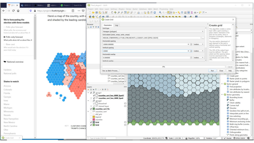
I’ve seen the Elections as an opportunity to finally dig into d3, and wanted to start with a hexagonal cartogram. I found some examples I liked, from FiveThirtyEight or twentyone – an «info century» blog, and got started. Instead of making a map a day, I ended up with the ‘a map a month’ version of the challenge. 🙂
So, I present you presidentials2019 ! 🥰 It’s ugly and laggy, and more a sketch than a project, but is my new baby on GitHub.
Steps
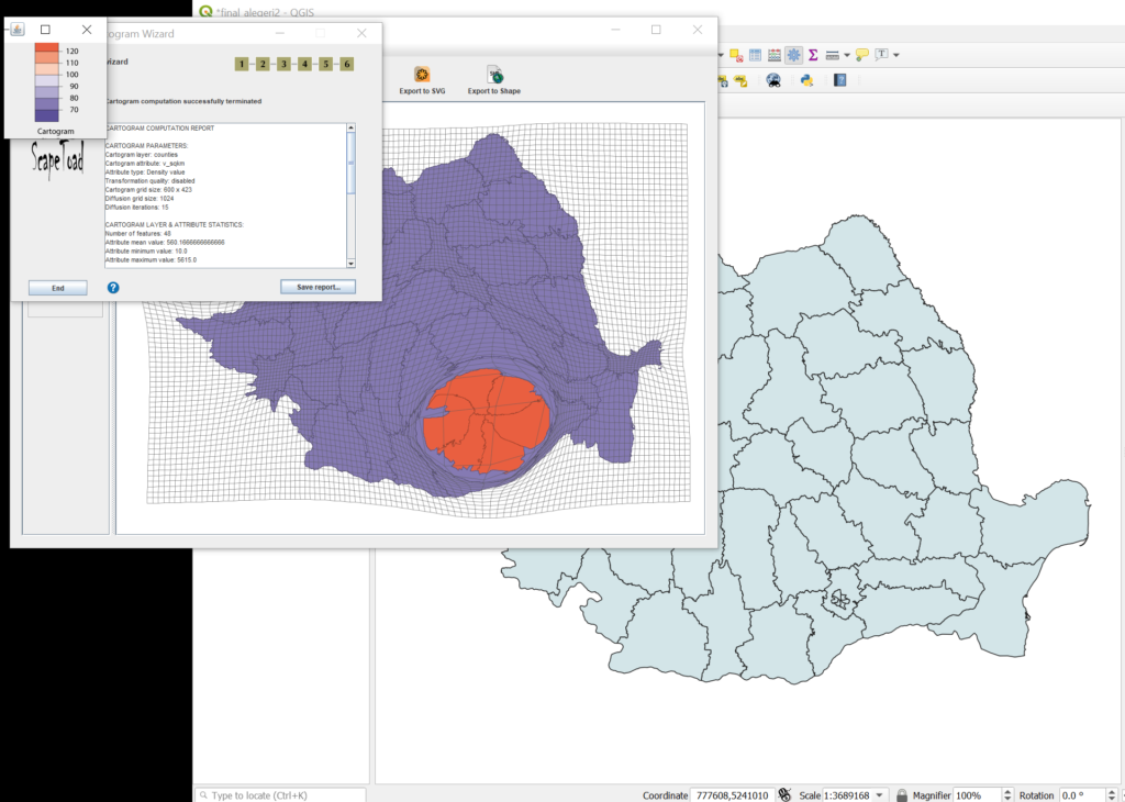
Basically, a cartogram is a distorted representation of a map, where the size is based on specific attributes, most often on population. That’s why cartograms have been used for Elections maps for a while now, they remove the false impression a vast amount of land with few voters can give in the choropleth maps.
There are many types of cartograms, related to the continuity, or the shape of the resulting elements. For example, this, this or this classification. The type of cartogram that preserves most of the original shapes is obtained using the Gastner-Newman method. The Dorling technique creates non-contigous circle elements (they don’t preserve shape), the Demers cartograms are a variant of a Dorling cartogram, where squares are used in place of circle.
For Romania, a cartogram would have shown clearer how Bucharest, the country capital, had voted. In 2017, there were 2.104.967 residents in Bucharest (9% from the country population), that means approximately 8771 people per square kilometer.
I have used geographic data (counties from a file geodatabase) from Geoportalul Agenției Naționale de Cadastru și Publicitate Imobiliară and Elections data (in csv form) from Alegeri Prezidențiale 10 Noiembrie 2019.
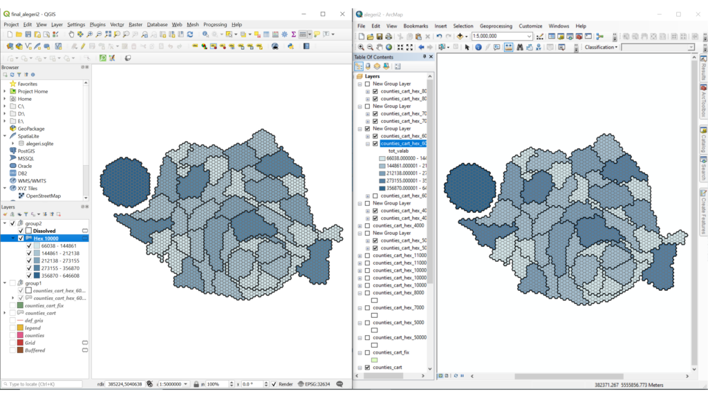
The steps to create a hexagonal cartogram involve the creation of a Gastner-Newman cartogram, then the use of a hexagonal grid to cut the counties, and a Spatial Join to transfer the attributes to the smaller polygons. A cartogram can be derived either as a mass, from attributes in polygons, or as density. I have used the first method.
For ArcGIS I have found two tools that can be used to achieve this kind of cartogram, EsriCartograms and Create_Hexagon_Tessellation. For QGIS, I have used only the Create Grid tool, there is a Cartogram plugin I have tried, but I liked more the results from Scapetoad, an easy to use Java application for cartogram creation (their own description).
I have converted the resulting hexagonal cartogram, the original counties layer and the Gastner-Newman cartogram to geojson using GDAL ‘Convert Format’ (in QGIS), then I have used Mapshaper to simplify the geojson files, and bundle all the data into a single topojson file. This format reduces the file size because it stores geometries using shared line segments called arcs and has some other cool features, like topology-preserving shape simplification.
Then I have done a simple HTML/CSS/JS + d3 magic to view and style the layers in the browser. d3 can also be used to derive circle or rectangular cartograms, and non-contiguous cartograms, too, so I have added those three cartograms to the visualization, from various blocks.
d3 blocks are short examples created by users, that you can edit or borrow. Some complain that you can’t control the quality of the written code, and you can come to a poorer understanding of some aspects of the library. I myself find the blocks idea super cool, I think that helped d3 evolve so much.
I think the same result as using Scapetoad, Hexagonal grid and Spatial Join can be achieved using d3, too, but I’ll give it a try some other time. There is a cartogram library, and hexagonal mesh examples. Searching for Spatial Join examples , I’ve discovered another resource that looks interesting, turf.js, a JavaScript library for spatial analysis.
I wanted to show the results on maptheclouds, but also publish the code on GitHub. Therefore I have delayed the site deployment. First I have tried to create a d3 block from a GitHub gist, but I have exagerated with my code size, so I could not add all my files into a new gist. So I’ve ended up with this project on GitHub Pages. ¯\_(ツ)_/¯
TODO for the years to come, when I will have time: make the cartograms in R and Python, they have awesome tools for data visualization.
More on this and maybe a tutorial in another post.. I won’t go into explaining the analysis results for now, either. Until then, the maps are there, the statistics are there, but the question still remains unanswered:
Eu pentru cine votez? ( I’m not drunk… but I, for whom shall I vote? )
The Drunken Citizen (*)
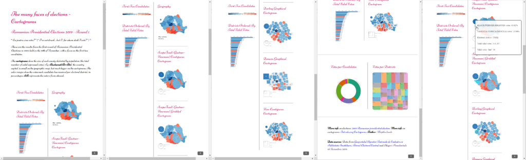
Here are some snapshots
Here’s a chaotic list of resources
Here’s me in the future, happy that my work shows up somewhere else outside my blog
- https://david.frigge.nz/30DayMapChallenge/maps.html (See Tools -> D3.js)
- https://public.tableau.com/shared/7R5XJ5ZY4
- https://twitter.com/maptheclouds/status/1198988178746748928
PS: Happy 14th birthday, OSGeo!